


YC S21
Fintech
Investments
Payments
Savings
About Product
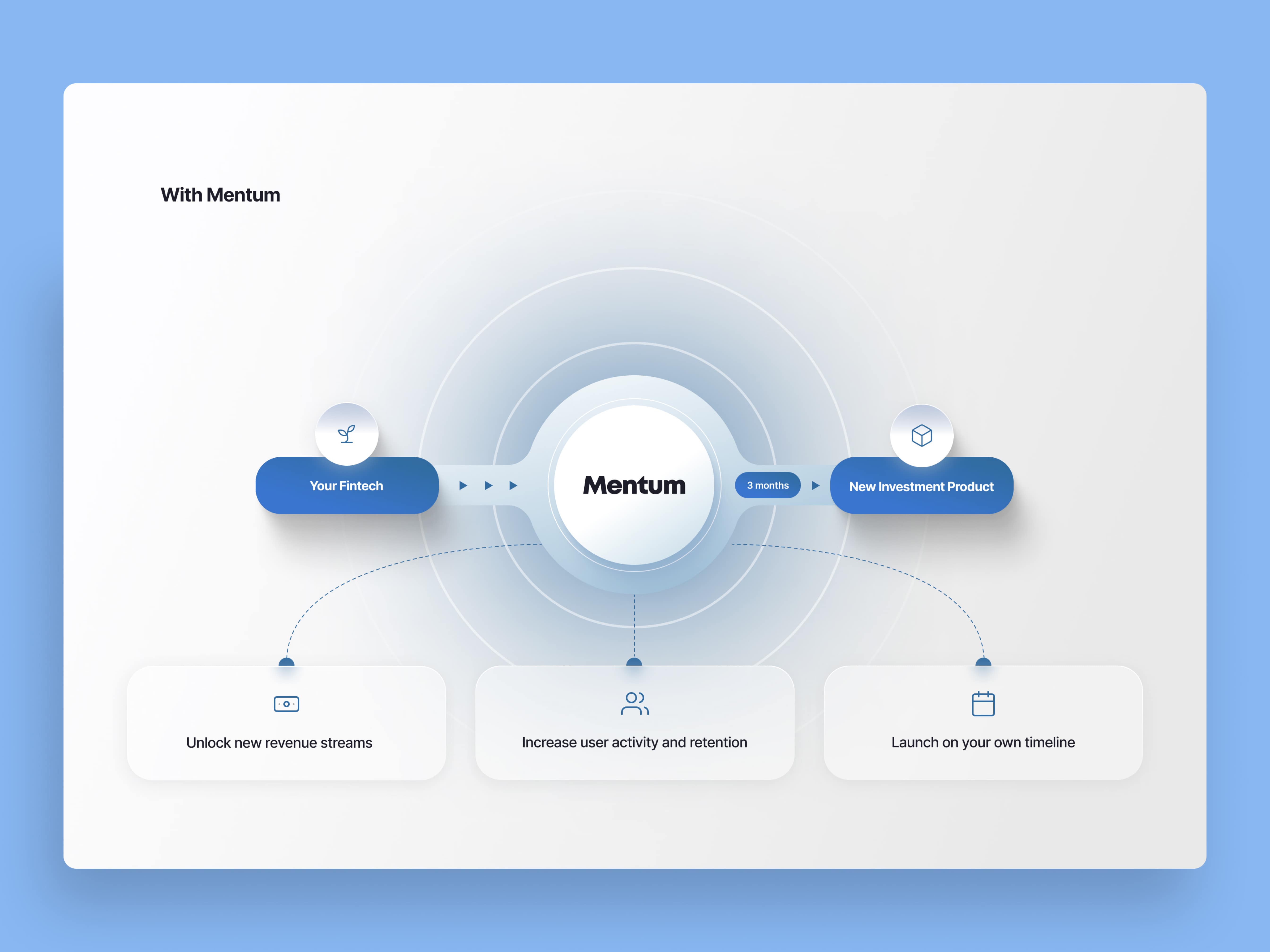
Mentum is a comprehensive investment platform that streamlines the process of creating, customizing, and managing accounts. With a clean and intuitive design, users can easily store their information securely on a single dashboard.
Location
🇺🇸 U.S.A
Industry
Startup
Plan
Pro
Create your project
What do you need help with?
Thank you! Your submission has been received!
Oops! Something went wrong while submitting the form.


One subscription and your hiring problems solved
Thank you! Your submission has been received!
Oops! Something went wrong while submitting the form.


Company
Resources


New episode is live! Ramen Talks by Awesomic
From $5M to $75M. Koby Conrad breaks down the growth playbook behind one of YC's fastest-growing startups.
