




How to Use Content Design in 2026 for Faster, Clearer Results

Key takeaways:
- Content design decides what information a user needs, in what order, and in what format. Writing the words is the last step, not the job.
- The discipline came out of the UK's Government Digital Service, and its founding rule still holds: start from a user need, not from a page you've been asked to fill.
- A content designer working inside the design file instead of a separate doc kills the copy-paste handoff that eats days on every release.
- Teams that tie content changes to a metric get taken seriously. Teams that argue about word choice don't.
Most product teams treat words as the thing you add once the screens look right. Someone builds the flow, someone else drops in "Submit" and "An error occurred," and the whole thing ships. Then support tickets arrive asking what the error meant.
Content design flips that order. You work out what the user needs to know at each step, then decide whether that need is best met by a sentence, a table, a diagram, or by deleting the screen entirely. The words come out of that decision instead of standing in for it.
This guide covers what the discipline actually is, how it differs from the roles it gets confused with, a process you can run next sprint, and how to prove the work moved something. If you're learning content design from scratch or trying to get it funded at your company, both paths are here.
What is content design, and where the term came from
Content design is the practice of working out what a user needs at a given moment and designing the clearest way to meet that need. Sometimes that's a paragraph. Sometimes it's a checklist, a chart, a progress indicator, or nothing at all.
The term comes from the UK's Government Digital Service, where the team rebuilding GOV.UK needed a name for work that was clearly design but produced sentences instead of screens. Their content design guidance still states the principle plainly: content design starts by taking a user need and meeting it in the best way possible.
That page also names the four things good content has to do: start with user needs, consider the amount and format and best place to publish, follow a consistent style, and stay up to date. Notice how little of that is about writing.
The reason this matters commercially is simple. A user who can't tell what a button does either guesses or leaves. Both outcomes cost you, and neither shows up in a design review where everyone already knows what the button does.
Content design vs UX writing vs copywriting vs content strategy
Content design, UX writing, copywriting and content strategy overlap enough that job ads use them interchangeably, which makes hiring and career planning genuinely confusing. The useful distinction is scope: what each role is allowed to change.
| Role | Core question | Typical output | Can change the flow? |
|---|---|---|---|
| Content design | What does the user need here, and what format meets it? | Structure, hierarchy, labels, sometimes a removed step | Yes |
| UX writing | What words go in this component? | Microcopy, error states, empty states, buttons | Rarely |
| Copywriting | How do we persuade someone to act? | Landing pages, ads, campaign copy | No |
| Content strategy | What content should exist at all, who owns it, how is it governed? | Taxonomy, governance model, editorial standards | Through policy |
In practice the lines blur by company size. At a 20-person startup one person does all four. At an enterprise, ux content design sits inside the product org while campaign copy sits in marketing, and the two rarely share a backlog.
The trap is treating content strategy design as a fancier name for writing. Strategy work decides which content exists and who maintains it; content design decides how a specific need gets met.
You need both, and confusing them is how companies end up with a beautiful style guide and an onboarding flow nobody can finish. A joined-up UX design content strategy names who owns each of those layers before anyone argues about a button.
Why unclear content costs more than it looks
Vague content doesn't fail loudly. It produces a slightly higher drop-off, a few more support tickets, and a sales team that answers the same question every week, and none of those get traced back to a sentence.
The US government hit this problem hard enough to legislate it. The Plain Writing Act of 2010 requires federal agencies to write content for the public in language its specific audience can understand, on the reasoning that unclear public information wastes both citizens' time and the government's.
Your product has the same economics on a smaller scale. Every ambiguous label is a question someone has to answer, and answering it repeatedly costs more than fixing it once.
The practical move is to stop treating copy questions as taste. "I prefer 'Continue'" is an opinion. "Seven people in testing thought 'Continue' meant they'd be charged" is a finding, and findings win arguments.
We see the same pattern at Awesomic across the 20,000+ projects we've delivered: the requests that come in as "make this page look better" are often content problems wearing a visual costume. The layout gets blamed because the layout is visible.

How to run a content design process
Most published processes describe the same seven moves under different names. Here's the sequence, and what each step actually produces.
- Understand the problem the team is solving, in the team's own words, before reading any existing copy.
- Define the user need as a sentence starting "As someone who..., I need to... so that..."
- Map every point in the flow where the user needs information, including emails and error states.
- Decide the format for each point before writing anything.
- Draft directly in the design file so the words and the layout fight it out early.
- Test the content with people who don't work at your company.
- Hand off with the rationale attached, not just the strings.
The steps most teams skip are three and four, and they're the ones that make the difference between this discipline and fast writing. If your team has a written UX workflow, these steps slot into its synthesis and design stages rather than running alongside them.
Start from the need, not the screen
When a ticket says "write copy for the upgrade modal," the modal is already assumed. Ask what the user is trying to do and you sometimes find the modal is the problem.
Write the need down before you look at the design. If you can't state it in one sentence, nobody on the team can either, which is usually the real bug.
Choose the format before the words
A list of eleven plan differences is a table, not a paragraph. A three-state process is a progress indicator, not a sentence explaining which state you're in.
Ask a few questions of every content point before writing it:
- Would a table, diagram, or example carry this faster than prose?
- Can this be shown by the interface instead of described?
- Does the user need this now, or only if something goes wrong?
- What happens if we delete it entirely?
- Is there an existing pattern in the product that already answers this?
Deleting is the most underrated answer. A screen with one clear sentence beats a screen with four hedged ones, and it's cheaper to maintain.
Write inside the design file
Drafting in a separate document creates a copy-paste step, and copy-paste steps go stale. The moment a designer changes a layout, the doc is wrong and nobody knows.
Working in the design file also exposes length problems immediately. A label that reads fine in a doc and wraps to three lines in the component is a layout problem you want to find before engineering does.
Test the words, not just the flow
Usability tests usually measure whether people can complete a task. Add one question about what they expected a specific label to mean and you get content findings for free.
Ask people to explain a screen back to you in their own words. Where their explanation diverges from your intent, that's the sentence to fix.
You don't need a research team for this. Five people who match your audience, ten minutes each, will surface the misreadings that matter, and you can run it on a prototype before a line of code exists.
Hand off the reasoning, not just the strings
A spreadsheet of final copy tells an engineer what to type and nothing else. When the design changes two sprints later, whoever edits the text has no idea which constraints were load-bearing.
Leave the why attached to the what. A one-line comment saying "this says 'saved to drafts' rather than 'saved' because testers assumed 'saved' meant published" survives your departure and stops the same debate restarting.
How content design works on websites versus in products
Product content is read under pressure by someone mid-task. Website content is read by someone deciding whether to care at all. The same principles apply, but the constraints invert.
In-product, brevity wins because the user has a job to finish. On a marketing site, you need enough substance to answer real objections, and stripping copy to the bone often removes the exact detail that would have converted someone. Good website design and content work together on the same page rather than treating copy as filler between images.
This is where how web design impacts content marketing becomes concrete. A page's structure decides what gets read: headings set the scan path, and anything below a wall of text effectively doesn't exist. If your best proof point sits in paragraph four, the layout has buried it regardless of how well it's written.
That constraint gets sharper as teams publish more. Our guides to content creation automation and vibe marketing both run into the same wall: volume is easy to add, and structure is what decides whether any of it lands.
Awesomic runs into this constantly on web projects. When a client asks us to redesign a page that isn't converting, the fix is often structural rather than visual, because the page says the right things in the wrong order. Our branding work usually settles the message before anyone opens a design tool.
For a broader view of how structure shapes what people take in, our guide on why design matters to content covers the same tension from the design side, and our UX strategy guide covers how these decisions ladder up to product goals.
Tools that support content design work
The discipline doesn't need much tooling, but two problems are worth solving: keeping strings in one place, and keeping the design file and the shipped product in sync.
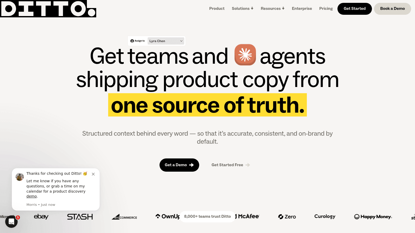
Ditto positions itself around a single source of truth for product copy, syncing strings between design files and code so the text in the mockup and the text in production don't drift apart. Its homepage names eBay, BigCommerce, McAfee and Curology among the teams using it.
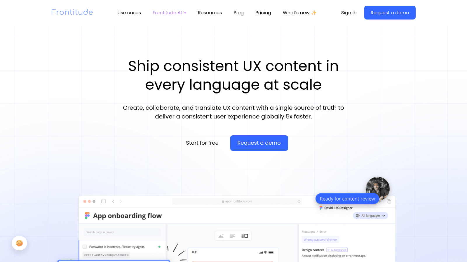
Frontitude covers similar ground with a heavier emphasis on multi-language delivery, pitching consistent UX content across every language a product ships in. If you're localizing, that's a different problem from simply keeping one language tidy.
| Job to be done | What to use | Why |
|---|---|---|
| Draft copy against real layouts | Your design tool's text layers | Length and wrapping problems surface immediately |
| Keep strings consistent across screens | A dedicated copy manager | Stops the same concept getting three names |
| Agree terminology | A one-page product glossary | Cheapest fix for the most common inconsistency |
| Validate comprehension | Any moderated test with 5 users | Catches misreadings no internal review will |
| Track what changed and why | Comments on the design file | The rationale is the handoff, not the string |
Start with the glossary. It costs an afternoon and resolves more arguments than any piece of software, because most content inconsistency is really terminology drift nobody wrote down.
How to prove content design moved something
This is where these careers stall, and practitioners say so openly. In a thread on r/uxwriting, a content designer with ten years at companies including Booking.com and Google argued that the way to stop being dismissed as a wordsmith is to think like a product manager.
A content design lead replied in the same thread that they'd been telling direct reports this for years: craft alone doesn't get you trusted with high-priority work.
The honest counterpoint arrived in the same thread. Another commenter asked where you're supposed to get that data when your organization isn't data-driven and nobody is measuring anything. That's the real situation at most companies, and it's anecdotal, but it matches what we hear from clients.
The workaround is to measure something small yourself rather than wait for a data team. Support ticket volume on a specific topic, completion rate on one form, or the number of times sales answers the same question in a month are all countable without instrumentation. Pick one, change the content, count again.
Then report the change in the metric, not the change in the copy. "Rewrote the error states" is invisible to a leadership team. "Password reset tickets dropped by a third after we changed one error message" is a budget conversation.
Building a content design portfolio and getting hired
A content design portfolio that shows finished screens gets rejected, because finished screens don't reveal any thinking. Hiring managers are trying to see how you decided, and screenshots hide exactly that.
Structure each case study around the decision instead of the deliverable:
- The user need, stated in one sentence
- What the content looked like before, and what specifically failed
- The options you considered, including the ones you rejected
- What you shipped and why that format
- What changed afterward, with a number if you have one
Two or three cases at that depth beat a gallery of twenty. If you're early and don't have shipped work, rewrite a real product's flow and document the reasoning the same way, being clear it's a self-directed exercise.
Content design jobs cluster where products are complex enough that misunderstanding is expensive: fintech, healthcare, government, developer tools, and enterprise software. Our piece on enterprise UX covers why those environments generate the most content problems, and the roles follow the problems.
Mistakes that quietly undo the work
The most common failure is doing the work after the design is approved. At that point you're a proofreader with a nicer title, because every structural decision has already been made.
The second is inventing a voice document nobody asked for. Tone guidelines matter, but a 40-page voice bible produced before anyone has fixed a broken flow reads as busywork to the rest of the team.
The third is arguing about words in review meetings. If you can't point to a user need or a finding, you're trading preferences, and the loudest person wins.
The fourth is treating consistency as the highest goal. Consistency is useful right up to the point where the consistent term is the one users don't understand, and then it's just a well-organized problem. Our overview of emerging UX trends is a decent reminder that patterns shift, and content standards need to shift with them.
Where to start on Monday
Pick the single screen your support team gets the most questions about. Write down the user need in one sentence, decide whether the current format actually serves it, and change one thing. Count the tickets before and after.
That loop is the whole discipline in miniature, and it's more convincing than any deck about why content design matters.
If you want the work done alongside the design rather than bolted on afterward, Awesomic matches you with vetted talent in up to 24 hours, covering web app design, product and web work on one flat monthly fee.
You can see what that looks like in our case studies, or Get started whenever you're ready.
FAQ
What is content design in simple terms?
It's deciding what a user needs to know at each point in a product or site, choosing the clearest format to deliver it, and then writing it. The format decision is the part that separates it from writing. A comparison table, a diagram, or removing a step can all be the right content design answer, and none of them involve better sentences.
Is content design the same as UX writing?
No, though the roles overlap heavily and many job ads use the terms interchangeably. UX writing generally means producing the words for components that already exist. Content design includes the authority to change what those components are, reorder a flow, or argue that a screen shouldn't exist. In small teams one person does both.
How do I start learning content design?
Take one real flow in a product you use, write down the user need behind each screen, and rewrite it, documenting why you made each change. That exercise teaches more than a course because it forces the format decision. Reading the GOV.UK content design guidance and any published design system's content section will give you the vocabulary to explain your choices.
What should a content design portfolio include?
Two or three deep case studies showing your reasoning, not a gallery of finished screens. Each should state the user need, what failed before, the options you weighed, what you shipped, and what changed after. Self-directed rewrites are acceptable early on as long as you label them honestly rather than implying they shipped.
Does content design affect SEO and marketing performance?
On websites, yes, because structure decides what gets read and indexed. Clear headings, scannable hierarchy, and content that answers the actual question tend to serve both readers and search engines. The overlap isn't total, though: product content optimizes for task completion and rarely needs to rank for anything.
One subscription and your hiring problems solved

FAQ


Awesomic is a revolutionary app that matches companies with vetted professionals across 30+ skill sets, from design and development to marketing and product. Based in San Francisco with a global core team, we offer a faster and more flexible alternative to traditional hiring through a subscription-based model. Awesomic delivers high-quality talent on demand, without the delays of recruiting.
We function as a subscription-based service that matches you to top-tier, vetted talent. Submit a project in just a few clicks and start receiving deliverables in as little as 24 hours. Scale your Awesomic plan up or down as your business needs change.
Every Awesomic subscription comes with unlimited revisions. You receive daily progress updates via the app, and you can provide feedback or request iterations as needed. If your project requires a different approach, you can request a talent rematch at any time, at no extra cost. You can also add teammates to collaborate and streamline feedback
A talent marketplace is a platform that utilizes data and intelligent matching algorithms to connect professionals with projects based on their skills, experience, and availability. While often used internally by large companies, Awesomic applies this model at scale, matching vetted global talent to your most critical business needs.
Hiring is time-consuming, expensive, and risky. Awesomic eliminates that problem. We rigorously vet all talent for technical ability, communication, and soft skills, ensuring only senior-level professionals work on your projects. You skip the job posts, interviews, and delays, and get straight to results.
No, Awesomic goes beyond design. While many clients utilize us for branding, UI/UX design, or motion graphics, we also provide vetted talent in no-code web development, product design, marketing, and more. Think of us as an extension of your team. A flexible, high-performing creative partner from planning to execution, whether you're building awesome products or scaling your team.
You can talk directly with your matched talent via the Awesomic app, connect via Slack, email, or schedule video calls. No matter the plan, you’ll receive daily updates in the app for every active task. You can also tag us in for any issues through our in-app customer chat.


