




Growth Design in 2026: How to Improve Products with User-Focused Ideas

Key takeaways:
- Growth design is product design pointed at a business metric: how people find a product, reach value, and come back, rather than how the core feature works.
- Only about a third of tested ideas at Microsoft improved the metric they were built to improve, which is the whole argument for shipping small and measuring.
- Changing a default moved organ-donor consent from 42% to 82% in a controlled experiment. Design decisions routinely beat persuasion.
- "Growth-driven design" is a separate thing: a web methodology that launches a working site early and improves it continuously instead of rebuilding every two years.
Two different disciplines share this name, and searching for either one returns both. It's worth separating them before going further.
Growth design is a product design specialism. A growth designer works on acquisition, onboarding, activation, and retention rather than the core product experience, and is measured on numbers rather than on shipped screens.
Growth-driven design is a website methodology created by Luke Summerfield and popularized through HubSpot. It replaces the big-bang redesign with a smaller launch, followed by continuous data-led improvement.
They come from different worlds but rest on the same idea: ship something real, measure it, and keep changing it. This guide covers both, starting with the product discipline, and it's honest about the parts that are contested.
What a growth designer actually does
A growth designer owns the journey around the product rather than the product itself. That means the signup flow, the empty state a new user lands in, the upgrade prompt, the referral mechanic, and the email that brings someone back on day seven.
The distinction that lands best comes from a comment on r/UXDesign: product designers build the core value, and growth designers lead users to that value as early and as often as possible. Same craft, different target.
The measurement difference is what changes day-to-day behavior. A product designer is usually judged on whether a feature works well. A growth designer is judged on whether a number moved, which means shipping smaller changes more often and being willing to have most of them fail.
| Core product design | Growth design | |
|---|---|---|
| Owns | The feature itself | The path to and from the feature |
| Typical work | Flows, components, systems | Onboarding, paywalls, prompts, emails, landing pages |
| Success looks like | Task completion, usability | Activation rate, conversion, retention, revenue |
| Cycle length | Weeks to months | Days to weeks |
| Research style | Interviews, usability testing | Experiments, funnel analysis, behavioral data |
| Works most closely with | Engineers, PM | PM, marketing, data, engineers |
Neither column is more senior than the other, despite how the titles sometimes get used. They're different bets about where the next unit of value comes from.
Why most good ideas don't work
The uncomfortable finding underneath growth design comes from the team that ran experimentation at Microsoft. In a 2013 paper by Kohavi and colleagues, the authors state it plainly: only one third of the ideas tested at Microsoft improved the metrics they were designed to improve, and success is even harder to find in a well-optimized product like Bing.
Sit with that for a second. These are ideas that survived internal review, got designed, got built, and shipped to real traffic. Two out of three did nothing or made things worse.
That's not an argument against having ideas. It's an argument against betting an entire quarter's roadmap on one of them. If your hit rate is roughly one in three, the winning strategy is more shots, each cheap enough that losing costs a week rather than a quarter.
The same paper contains a useful counterweight to the assumption that only big swings matter. A Bing experiment that slowed some users deliberately found that every 100 milliseconds of improvement was worth 0.6% of revenue, and the team calculated that an engineer improving server performance by 10 milliseconds more than paid for their fully loaded annual cost. Small and boring beats big and speculative more often than anyone expects.
At Awesomic we see the design version of this constantly. Clients arrive wanting a full redesign when the actual constraint is one step in a signup flow, and the redesign is both slower and less likely to move anything.
Design decisions beat persuasion
The most striking evidence for user-focused design changing behavior isn't from software at all. In a 2003 study in Science, Eric Johnson and Daniel Goldstein tested how defaults affect organ-donor consent, asking 161 people the same question with different starting states.
In the opt-in condition, where the default was not to be a donor, 42% consented. In the opt-out condition, where the default was to be a donor and people could change it, 82% did. Same question, same effort to change the answer, double the outcome.
Their country-level data is sharper still. Effective consent ran at 4.25% in Denmark and 17.17% in the UK under opt-in rules, against 99.98% in Austria and 99.91% in France under opt-out.
The lesson for product work isn't "use dark patterns to trap people." It's that the structure of a choice carries more weight than the words wrapped around it. If you're arguing about button copy while the default is set against the user's interest, you're optimizing the wrong layer.
Applied honestly, this means picking sensible defaults, pre-filling what you can reliably infer, and reducing the number of decisions someone has to make before they see value. Our guide to personalizing the user experience covers where that tips from helpful into presumptuous.
The test for whether you've crossed that line is simple: would you be comfortable if the user could see exactly why the default was set that way? A pre-ticked box that saves someone a step passes. A pre-ticked box that costs them money does not, and the short-term conversion gain gets repaid with refunds and churn.
This is also the cheapest category of growth work, which is why it's worth doing first. Changing a default, reordering two fields, or removing an optional question requires no new interface and can usually ship in a day.

Where growth design acts along the journey
Growth work is usually organized around a funnel, and the design lever is different at each stage. Naming which stage you're working on prevents the most common failure, which is optimizing a step that isn't the constraint.
At acquisition, design controls the landing page's clarity and the friction of the first form. At activation, it controls whether a new user reaches a genuinely useful moment in their first session, which is usually the highest-leverage stage and the most neglected.
At retention, design controls whether people have a reason and a reminder to come back, through habit loops, notifications, and progress. At revenue, it controls how and when upgrade decisions get presented. At referral, it controls whether sharing is a natural step or a buried menu item.
Find your worst drop-off before choosing what to design. Improving a step that 10,000 people hit each month is worth more than perfecting one that 200 people reach, however much better the second version looks. Our post on SaaS customer retention goes deeper on the back half of that funnel, which is where most of the durable value sits.
Activation deserves special attention because it's consistently underfunded relative to its leverage. Acquisition work is visible and easy to justify, so it gets the budget, while the first-session experience that determines whether any of that traffic sticks is treated as an engineering detail.
A useful diagnostic: write down what a new user must do to get real value from your product, then measure what share of signups actually do it in week one. If that number is under a quarter, no amount of top-of-funnel spend will fix your growth, because you're pouring water into a bucket with a hole in it.
How to run a growth design experiment
The process matters more than any individual idea, because the process is what converts a one-in-three hit rate into compounding progress.
- Pick the funnel stage with the worst drop-off, using data rather than instinct.
- Write a hypothesis in the form "we believe changing X for [users] will improve [metric] because [reason]."
- Decide the success threshold and the minimum sample before you build anything.
- Design the smallest version that would prove or kill the idea.
- Ship it to a slice of traffic with a proper control group.
- Run it long enough to cover a full weekly cycle, and don't peek early.
- Write down the result either way, including what you'd try next.
Step seven is the one teams skip, and it's where the compounding actually happens. A team with a written record of forty experiments knows things about its users that no competitor can buy.
Where this sits in your calendar depends on your UX workflow; experiments need a reserved slot, or delivery deadlines will eat them. In SaaS product development that slot is usually carved out of the discovery track.
Keep the losers
Failed experiments feel like waste and are treated as embarrassing, which is how the same idea gets retried every eighteen months by a new hire. Adobe's design team has written about treating a failed growth experiment as a step that needs its own process: restore team morale, understand why it failed, and plan the next move.
A one-page log with the hypothesis, the change, the result, and the date is enough. The point is that "we tried that" becomes a checkable fact rather than a vague memory.
Watch for the skeptics' point
Growth design attracts genuine skepticism, and it's worth engaging with rather than dismissing. In the same Reddit thread quoted earlier, the top responses to the question of what separates growth designers from product designers were blunt: "It's just words man," and "Is this a fancy way of saying marketing?"
That criticism has teeth when growth design becomes metric-chasing detached from user value. If your experiments consistently improve conversion while support complaints rise, you're not doing growth design, you're extracting short-term numbers from goodwill you didn't build.
Growth-driven design: the website methodology
Now the other discipline. Growth driven website design applies the same logic to websites, and it exists because the traditional redesign is a bad bet: a company spends months and a large budget building every page to perfection, launches, then leaves it untouched for two years while it goes stale.
It shares ancestry with growth hacking design, the mid-2010s startup practice of testing cheap acquisition ideas fast, but it's aimed at a website rather than at a channel, and it's meant to be a permanent operating model rather than a scramble.
Growth-driven web design splits into three phases. First, strategy: agree the goals, the audience, and what you're actually trying to change. Second, the launch pad site, which Summerfield describes as a site that looks and performs better than what you have today but is explicitly not the final product. Third, continuous improvement, where you keep shipping changes informed by how the live site performs.
The launch pad is the part that makes people nervous, and it's the point. Getting a better site live in weeks means you start learning from real visitors immediately, instead of guessing for six months and then discovering your assumptions were wrong at launch.
The version of this we see work at Awesomic is unglamorous: ship the pages that carry traffic, leave the rest on the old template, and fix the next-worst page each month. Nobody outside the team notices the sequence, and the site is improving the whole time.
| Traditional redesign | Growth-driven design | |
|---|---|---|
| Time to launch | Months, everything at once | Weeks, core pages first |
| Budget shape | Large upfront, then nothing | Smaller upfront, ongoing monthly |
| What informs it | Stakeholder opinion and a brief | Live performance data |
| Risk | Assumptions untested until launch | Wrong assumptions surface in week two |
| After launch | Largely untouched for ~2 years | Continuous improvement cycles |
| Fits | Fixed-scope projects, one-off rebuilds | Teams that can sustain ongoing work |
The honest caveat is that growth-driven design only works if the ongoing part is genuinely resourced. A launch pad site that never gets its improvement cycles is just an unfinished website, and that's a worse outcome than a traditional redesign.
It also assumes you're building rather than duplicating. If you're standing up the launch pad from an existing site, our guide on how to copy a website covers what actually transfers and what you'll be rebuilding anyway.
Choosing an agency or writing a proposal
If you're evaluating a growth driven design agency, the questions that separate substance from vocabulary are all about the second half of the engagement. Anyone can build a launch pad, and plenty of shops now sell custom growth-driven website design that is a normal project with a monthly retainer bolted on.
Ask what happens in months two through twelve, how many changes ship in a typical month, how they decide what to work on, and what they do when an experiment fails. Ask to see a log of changes on an existing client site with the reasoning attached.
A credible growth driven design proposal names the metric it's trying to move, defines the launch pad scope tightly, and specifies the ongoing cycle: how many hours, how often you meet, and what the reporting looks like.
If the proposal is a page count and a fixed price with no continuous phase, it's a traditional redesign with a fashionable label. Our comparison of product design agencies covers the wider question of who to hire.
Where subscription models fit is the ongoing phase, which is exactly the part project-based pricing handles badly. Awesomic works as a flat monthly fee with unlimited revisions and matching in up to 24 hours, which suits a team shipping continuous changes rather than one big build.
Our mid-market page covers how that runs at scale, and you can Book demo to talk it through.
Measuring it without drowning in dashboards
You need three things: a funnel view showing where people drop off, an event stream telling you what they did, and a way to compare a variant against a control.
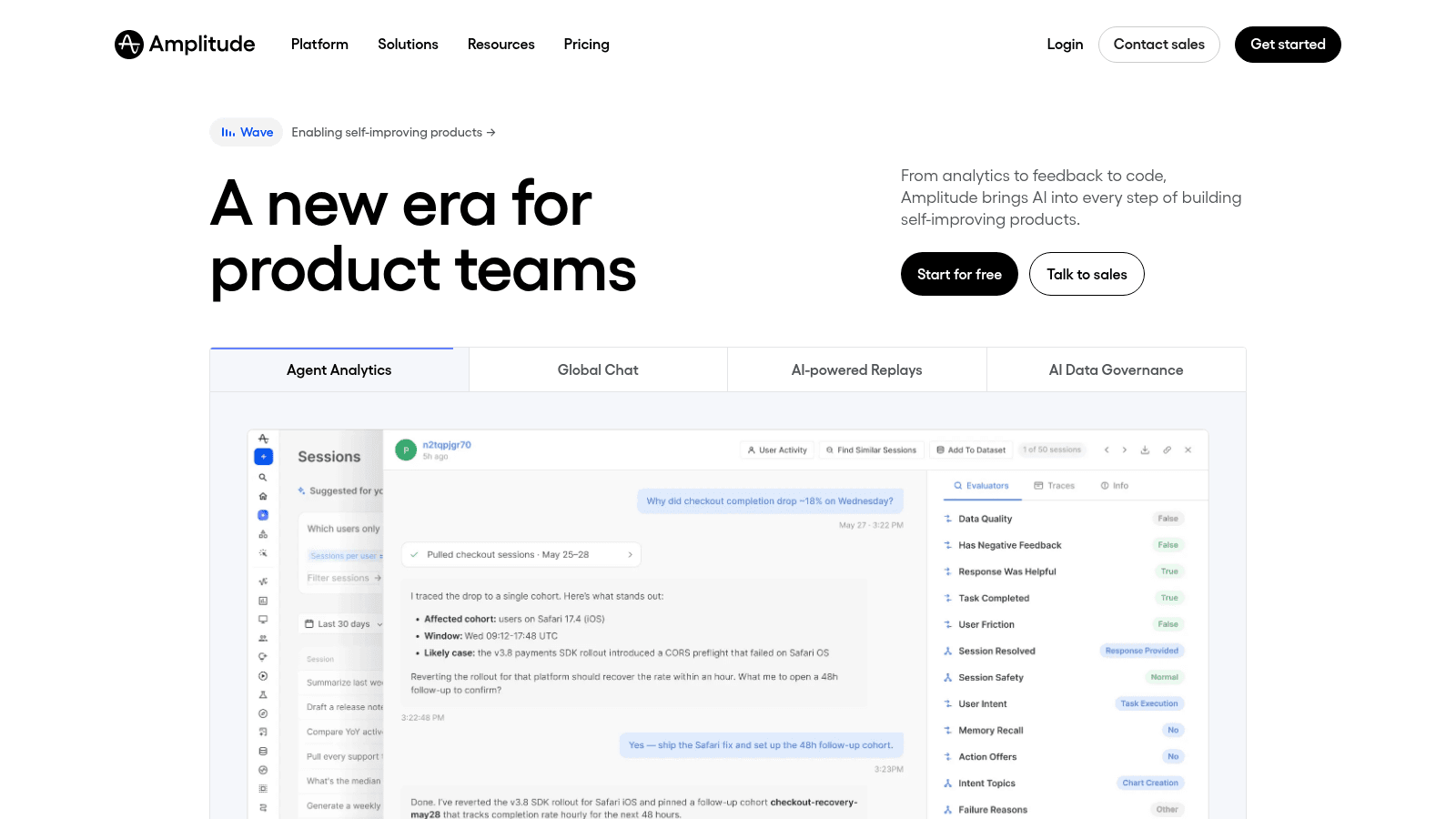
Amplitude is the common choice for the first two, positioning itself around product analytics feeding directly into how teams build. The specific vendor matters less than having one agreed source of truth, because two teams with two analytics tools will spend more time reconciling numbers than acting on them.
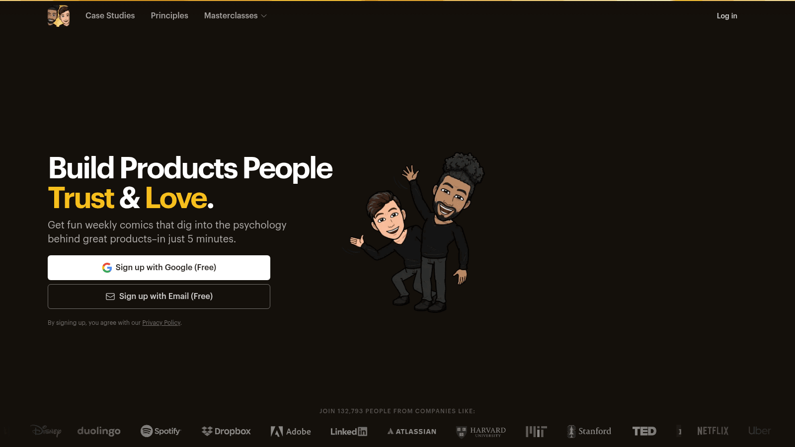
Growth.Design is worth knowing as a learning resource rather than a tool. It publishes free weekly case studies as comics that break down the psychology behind real product decisions, and its homepage shows 132,793 subscribers from companies including Duolingo, Spotify and Netflix. It's one of the few places that teaches the reasoning rather than the vocabulary.
Pick two metrics per quarter and ignore the rest. Teams that track twenty numbers respond to none of them, and the dashboard becomes a thing you show rather than a thing you use. Our digital product design guide covers how this fits the wider process.
Where to start
Open your analytics, find the step where the most people leave, and design one small change to that step. Ship it to half your traffic, give it two weeks, and write down what happened whether it worked or not.
That single loop, repeated, is growth by design rather than growth by accident. Everything else is scaffolding around it.
If you want to hear how other founders built that habit early, our startup journey story covers what it looked like in practice, and our product designer hiring page is there when the constraint becomes capacity rather than ideas.
FAQ
What is growth design?
Growth design is product design focused on business outcomes across the user journey: acquisition, onboarding, activation, retention, and revenue, rather than on the core feature set. Growth designers work in shorter cycles than product designers, ship smaller changes, and are measured on whether a metric moved rather than on the quality of a finished flow.
How is growth design different from growth-driven design?
They're separate disciplines with confusingly similar names. Growth design is a product design role inside a software team. Growth-driven design is a website methodology created by Luke Summerfield and popularized by HubSpot, which replaces the big-bang redesign with a quick launch pad site followed by continuous data-led improvement. Both favor shipping early and iterating, but one is a job and the other is a project model.
Is growth design just marketing with a design title?
That criticism comes up often, including from designers, and it's fair whenever growth work chases numbers without regard for user value. The difference in practice is ownership of the interface itself: growth designers change product surfaces, not just campaigns. If conversion is rising while complaints rise with it, the skeptics are right about that team.
How many growth experiments actually succeed?
At Microsoft, roughly one in three tested ideas improved the metric it was designed to improve, and the rate is lower in already-optimized products. That's the reason the discipline emphasizes many small, cheap tests over a few large bets, and why keeping a written record of failures matters as much as celebrating wins.
What should a growth driven design proposal include?
The metric it aims to move, a tightly scoped launch pad phase with a date, and an explicit continuous-improvement phase covering monthly hours, cadence, decision-making process, and reporting. If the ongoing phase is vague or absent, you're buying a traditional redesign under a different name, and the value of the methodology is entirely in that ongoing phase.
One subscription and your hiring problems solved

FAQ


Awesomic is a revolutionary app that matches companies with vetted professionals across 30+ skill sets, from design and development to marketing and product. Based in San Francisco with a global core team, we offer a faster and more flexible alternative to traditional hiring through a subscription-based model. Awesomic delivers high-quality talent on demand, without the delays of recruiting.
We function as a subscription-based service that matches you to top-tier, vetted talent. Submit a project in just a few clicks and start receiving deliverables in as little as 24 hours. Scale your Awesomic plan up or down as your business needs change.
Every Awesomic subscription comes with unlimited revisions. You receive daily progress updates via the app, and you can provide feedback or request iterations as needed. If your project requires a different approach, you can request a talent rematch at any time, at no extra cost. You can also add teammates to collaborate and streamline feedback
A talent marketplace is a platform that utilizes data and intelligent matching algorithms to connect professionals with projects based on their skills, experience, and availability. While often used internally by large companies, Awesomic applies this model at scale, matching vetted global talent to your most critical business needs.
Hiring is time-consuming, expensive, and risky. Awesomic eliminates that problem. We rigorously vet all talent for technical ability, communication, and soft skills, ensuring only senior-level professionals work on your projects. You skip the job posts, interviews, and delays, and get straight to results.
No, Awesomic goes beyond design. While many clients utilize us for branding, UI/UX design, or motion graphics, we also provide vetted talent in no-code web development, product design, marketing, and more. Think of us as an extension of your team. A flexible, high-performing creative partner from planning to execution, whether you're building awesome products or scaling your team.
You can talk directly with your matched talent via the Awesomic app, connect via Slack, email, or schedule video calls. No matter the plan, you’ll receive daily updates in the app for every active task. You can also tag us in for any issues through our in-app customer chat.


