




How to Run a Design System Audit in 2026 for Better Team Workflow

Key takeaways:
- A design system audit inventories what's actually shipping and compares it against what the system says should ship. The gap between those two is the finding.
- Run it through three separate lenses: UI consistency, usability heuristics, and accessibility. They surface different problems and mixing them produces an unusable list.
- Severity ranking is what makes an audit actionable. Without it you hand a team 300 issues and nothing changes.
- Nobody publishes fixed pricing for audits, because cost scales with component count, platform count, and how much of the system exists only in someone's head.
Design systems decay quietly. Someone ships a one-off button under deadline, someone else copies it because it's already there, and eighteen months later you have nine button variants, four blues that are almost the same, and a component library that describes a product you no longer have.
Nobody notices, because each individual decision was reasonable. The cost shows up as designers rebuilding things that exist, engineers asking which version is correct, and an interface that feels subtly inconsistent without anyone being able to point at why.
An audit is how you find out how bad it is. This guide covers what to inspect, the three lenses to run separately, how to rank what you find, what tooling helps, and what the work actually costs.
What a design system audit is
A design system audit is a structured comparison between three things: what your design system documents, what your design files contain, and what your production code actually renders.
Most teams assume those three agree. They almost never do. The documentation describes an aspiration, the design files contain the aspiration plus a year of exceptions, and production contains whatever shipped under pressure.
It's worth separating from two adjacent activities. A UX audit evaluates whether the product is usable; a design system audit evaluates whether the building blocks are consistent, documented, accessible, and actually used. You can have a perfectly consistent system applied to a confusing product.
The output isn't a verdict. It's an inventory of specific, located, ranked discrepancies that someone can work through, which is a very different artifact from a presentation about design debt.
When you actually need one
Audits are worth running when a specific symptom appears, not on a schedule. Four signals are reliable.
Designers keep rebuilding components that already exist, usually because they can't find them or don't trust that the existing one is current. Engineers ask which of several similar components is the right one.
A rebrand, a platform addition, or an accessibility requirement lands and nobody can scope it, because nobody knows how many things would have to change. Or adoption is visibly low and you want to know whether the system is being ignored or is genuinely unfit for the work.
The one bad reason to run an audit is that a new design lead wants to demonstrate rigor. That produces a thorough document nobody acts on, and it burns the team's willingness to participate in the next one.
At Awesomic the request usually arrives disguised as a redesign. A client asks for the product to be modernized, and the first week reveals the real problem is that four teams have been building independently against a system nobody maintained.
It's also a reasonable moment to bring in outside help, since an inventory carries more weight when the person taking it has no stake in the result.
The three lenses to run separately
The most useful structure for this came from practitioners rather than a methodology book. In a r/userexperience thread asking how to run a design audit properly, the top answer split it cleanly into three tracks: heuristic analysis for UX, WCAG tests for accessibility, and a sheet measuring the implemented product's accuracy against the designs for UI consistency.
That split is worth adopting exactly, because each lens needs a different reviewer, a different method, and produces a different kind of fix.
| Lens | What you're checking | Method | Who runs it |
|---|---|---|---|
| UI consistency | Does production match the system? Colors, type, spacing, states, component variants | Side-by-side comparison, recorded in a sheet | Designer, ideally not the system's author |
| Usability heuristics | Do the patterns themselves work? | Heuristic evaluation against a named set | Someone with UX depth |
| Accessibility | Contrast, focus, keyboard, labels, structure | Automated scan plus manual keyboard and screen-reader passes | Whoever owns accessibility, plus tooling |
| Documentation | Is each component documented, current, and findable? | Coverage check against the component list | System maintainer |
| Adoption | Is the system actually used, and where isn't it? | Code search for hard-coded values and one-off components | Engineer |
The fourth and fifth rows are the ones teams add after their first audit, once they discover that a beautifully consistent system with no documentation gets ignored anyway.
For the heuristics lens, Nielsen's ten heuristics remain the standard reference. Jakob Nielsen developed them with Rolf Molich in 1990 and refined them in 1994 after a factor analysis of 249 usability problems, and they haven't changed since. In a field that rewrites itself every few years, a 1994 document still being the default is worth noticing.
For accessibility, audit against WCAG 2.2. Its criteria are graded across three conformance levels and phrased so that passing or failing is a matter of checking rather than opinion.
That property is what makes accessibility the most productive lens to start with. Its findings arrive pre-agreed, so nobody spends a meeting debating whether a 3:1 contrast ratio is really a problem, and an audit that opens with undeniable findings buys credibility for the arguable ones later.

How to audit an existing design system
Two to four weeks is realistic for a mid-sized product. Trying to do it in a sprint produces a partial inventory that gets abandoned.
- List every component the system claims to have, from documentation rather than from the design file.
- Screenshot every instance of each component as it appears in production, across platforms and breakpoints.
- Record each mismatch in one sheet: component, where it appears, what differs, and which lens caught it.
- Run the automated accessibility scan across key flows, then do a manual keyboard-only pass.
- Run the heuristic evaluation separately, on flows rather than components.
- Search the codebase for hard-coded colors, spacing values, and locally-defined components.
- Rank everything by severity and effort, then group findings into themes rather than presenting a flat list.
Step two is the one people cut and the one that carries the value. An audit built from design files audits your intentions; an audit built from production audits reality.
Record findings so they can be fixed
The same Reddit thread had a useful description of how to catalog properly. One practitioner who runs heuristic analyses regularly captures, for each issue: the problem, its location, the specific heuristic it violates, a fuller explanation of why it's a problem, and a note toward the fix.
Adopt those fields verbatim. The "why it's a problem" field is what stops findings being dismissed as preference, and the location field is what makes the work assignable. A finding without a location is a complaint.
Keep one sheet, not one per lens. Three separate documents guarantees that nobody sees the pattern where the same component appears in all three.
Rank severity before you present anything
An unranked audit is where good work goes to die. The same thread offered a four-level scale that's simple enough to apply consistently: minor violations not likely to impede progress; moderate violations likely to cause some friction; significant violations causing significant friction; and severe violations that completely prevent users from completing a task.
Apply that alongside a rough effort estimate, and the plan writes itself. Severe and cheap gets fixed this week, severe and expensive becomes a project, minor and expensive gets closed as won't-fix, which is a legitimate and underused outcome.
Present the themes, not the spreadsheet. "Form components are inconsistent across four teams and three of them fail contrast" is a decision leadership can act on; 300 rows is not.
A design system audit checklist
Use this as a starting design system audit template and cut what doesn't apply. It covers the categories that generate findings in nearly every audit.
- Color: every value in production traced to a token, contrast checked at every usage
- Typography: sizes, weights, and line heights against the defined scale, including responsive steps
- Spacing: a single scale in use, with hard-coded values found and counted
- Components: every variant catalogued, duplicates identified, orphans flagged for removal
- States: default, hover, focus, active, disabled, loading, error, and empty for each interactive component
- Accessibility: contrast, focus visibility, keyboard order, labels, headings, and target sizes
- Content: terminology consistent, tone consistent, error messages following one pattern
- Documentation: each component has usage guidance, code reference, and a last-reviewed date
- Adoption: which teams use the system, which don't, and what they build instead
The states row alone typically produces a third of the findings, because states are where the pressure to ship shows up first. Our design system guide covers how to structure the system these checks run against.
Tooling that helps
You can run an audit with a spreadsheet and screenshots, and for a small product that's the right call. At scale, three categories of tool reduce the manual work.
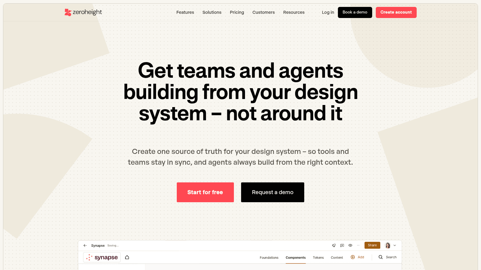
Documentation platforms like zeroheight exist to keep one source of truth for the system, pitching themselves around keeping tools and teams in sync. For audit purposes the value is the coverage view: it becomes obvious which components have documentation and which never got any.
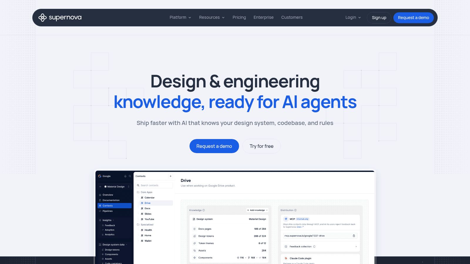
Supernova sits closer to the pipeline between design and code, covering design tokens and their distribution. That matters for the adoption lens, because token coverage is a measurable proxy for whether the system is actually being used rather than admired.
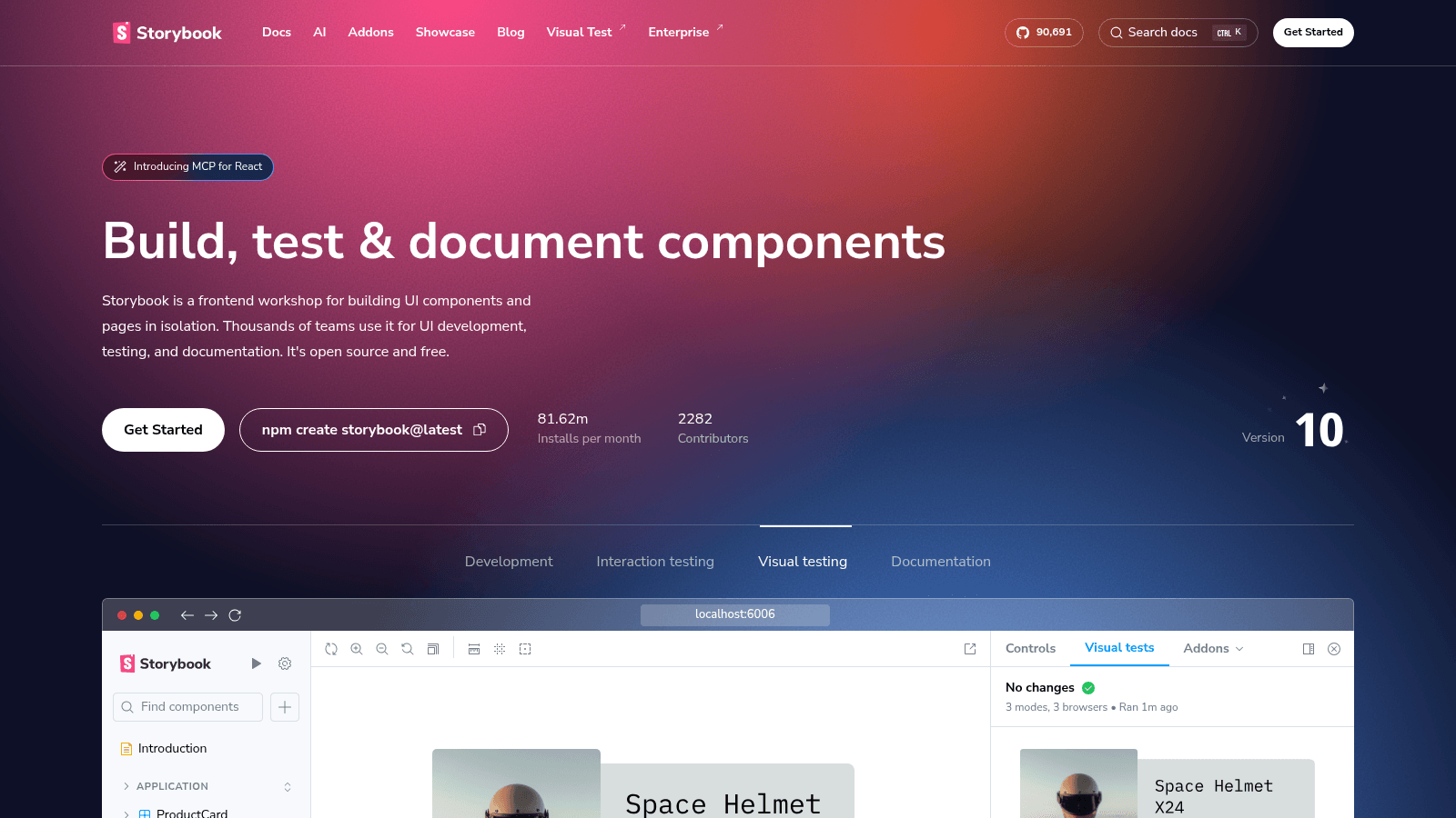
Storybook renders components in isolation from the real code, which makes it the fastest way to compare what engineering built against what design specified, state by state. If your team already runs it, your UI consistency audit is substantially easier.
Alongside those, an automated accessibility checker will catch a meaningful share of WCAG issues in minutes. It won't catch the ones that need judgment, like whether focus order is logical, so treat the scan as the start of the accessibility lens rather than the whole of it.
What a design system audit costs
Here's the honest answer on design system audit service cost: essentially nobody publishes a fixed rate, and any pricing for design system audit work quoted without scope attached is meaningless.
Cost scales with a few specific things. How many components exist, how many platforms and breakpoints they render across, how many separate teams have been building against the system, how much of it is documented versus living in someone's memory, and whether you want the audit alone or the remediation too.
That last variable is the big one. An audit produces a document; fixing what it finds is usually several times the effort, and teams that budget only for the audit end up with a well-researched list of problems they can't act on.
Here's the rough shape of what drives a quote, so you can size your own before asking anyone.
| Cost driver | Cheap end | Expensive end |
|---|---|---|
| Component count | Under 30, one library | 100+, several libraries |
| Platforms and breakpoints | Web only, two breakpoints | Web, iOS, Android, tablet |
| Contributing teams | One team, one repo | Four or more, independent codebases |
| Documentation state | Current and centralized | Tribal knowledge, no single source |
| Scope | Audit only, findings handed over | Audit plus remediation and governance |
Our own pricing is public, which is unusual in this category: Awesomic is $1,490 a month for the Graphic Pack and $2,995 for All-in-one, or $1,190 and $2,396 billed quarterly on a three-month minimum, with a dedicated 1-to-1 tier quoted custom.
A subscription fits audit work specifically because the shape of the effort is a burst followed by maintenance, which is awkward to price as a fixed project. Our enterprise page covers larger systems, case studies show the delivery, and our SaaS design services overview covers the product context.
When comparing design system audit pricing across vendors, ask three things: what you physically receive at the end, whether remediation is included or billed separately, and who owns the findings document in six months. Our agency selection checklist covers the wider evaluation.
Turning findings into work that happens
The audit is the easy part. Most of them fail at the handover, when a thorough document meets a roadmap with no space in it.
Group findings into three buckets by what they need. Quick fixes that a designer or engineer can absorb into normal work. Component-level rework that needs a small project. And systemic issues, like four teams building independently, that need a governance decision rather than design effort.
Attach the third bucket to a named owner and a date, or it won't happen. Systemic findings are the most valuable part of an audit and the least likely to be actioned, because they belong to nobody in particular.
The first bucket is where extra hands pay off fastest, since quick fixes are numerous, individually small, and exactly the kind of work an internal team never gets to. That's the slice Awesomic most often picks up after an audit, on the same flat monthly fee as everything else.
Then re-audit a narrow slice in three months rather than repeating the whole thing in a year. Checking whether the twelve severe findings got fixed takes an afternoon and tells you whether the process works. Our piece on enterprise UX covers why this gets harder as the number of contributing teams grows.
Staying audit-ready
The goal isn't to audit well, it's to need auditing less. Audit-ready system design mostly comes down to habits that prevent drift rather than detecting it.
Audit design system components on a rolling basis instead of all at once: put a last-reviewed date on every one, and treat anything over a year old as unverified.
Add a contribution path so that when someone needs a variant that doesn't exist, the route to adding it properly is easier than building a one-off. And make accessibility conformance part of the definition of done, since it's the cheapest category to prevent and the most expensive to retrofit.
The structural fix is ownership. Systems that decay usually have no named maintainer, or have one whose actual job is something else. If that's your situation, adding capacity is more effective than adding process, and our overview of on-demand design support covers how teams cover that gap without a permanent hire.
It also helps to decide, before the next audit, which framework you're evaluating against, since findings are only comparable if the standard held constant between runs. Our roundup of UX design frameworks covers choosing one, and the standard itself should come from your product design strategy rather than from whoever ran the last review.
Start with one component
Don't schedule a three-week audit to find out whether you have a problem. Pick your most-used component, screenshot every instance of it in production, and compare them against the documentation.
If they match, your system is healthier than most and you can skip the full exercise. If you find five variants and two contrast failures in the most-used component in the product, you have your answer and your business case. When the findings outrun what your team can absorb, Book demo and we'll scope the remediation with you.
FAQ
What is a design system audit?
A structured comparison between what your design system documents, what your design files contain, and what production actually renders. The discrepancies between those three are the findings. It differs from a UX audit, which evaluates whether the product is usable, since a consistent system can be applied to a confusing product.
How do you audit an existing design system?
Inventory the components from documentation, screenshot every instance as it appears in production across platforms and breakpoints, and record each mismatch in one sheet with its location and the lens that caught it. Run accessibility scanning plus a manual keyboard pass, evaluate flows against usability heuristics separately, and search the codebase for hard-coded values. Then rank by severity and effort.
What should a design system audit checklist cover?
Color and token coverage with contrast checks, the type scale, spacing consistency, every component variant, all interactive states including focus and error, accessibility against WCAG, content and terminology consistency, documentation coverage with review dates, and adoption across teams. States alone typically generate about a third of findings.
How much does a design system audit cost?
Nobody publishes fixed pricing, because cost scales with component count, platforms and breakpoints, how many teams contribute, and how much of the system is undocumented. The bigger variable is whether remediation is included: fixing findings usually costs several times the audit itself, and budgeting only for the audit leaves you with a list you can't act on.
How often should you audit a design system?
Run a full audit when a symptom appears rather than on a fixed schedule: rebuilt components, engineers asking which version is right, an incoming rebrand or accessibility requirement, or visibly low adoption. Then re-check a narrow slice every few months to confirm the severe findings actually got fixed, which takes an afternoon.
One subscription and your hiring problems solved


FAQ


Awesomic is a revolutionary app that matches companies with vetted professionals across 30+ skill sets, from design and development to marketing and product. Based in San Francisco with a global core team, we offer a faster and more flexible alternative to traditional hiring through a subscription-based model. Awesomic delivers high-quality talent on demand, without the delays of recruiting.
We function as a subscription-based service that matches you to top-tier, vetted talent. Submit a project in just a few clicks and start receiving deliverables in as little as 24 hours. Scale your Awesomic plan up or down as your business needs change.
Every Awesomic subscription comes with unlimited revisions. You receive daily progress updates via the app, and you can provide feedback or request iterations as needed. If your project requires a different approach, you can request a talent rematch at any time, at no extra cost. You can also add teammates to collaborate and streamline feedback
A talent marketplace is a platform that utilizes data and intelligent matching algorithms to connect professionals with projects based on their skills, experience, and availability. While often used internally by large companies, Awesomic applies this model at scale, matching vetted global talent to your most critical business needs.
Hiring is time-consuming, expensive, and risky. Awesomic eliminates that problem. We rigorously vet all talent for technical ability, communication, and soft skills, ensuring only senior-level professionals work on your projects. You skip the job posts, interviews, and delays, and get straight to results.
No, Awesomic goes beyond design. While many clients utilize us for branding, UI/UX design, or motion graphics, we also provide vetted talent in no-code web development, product design, marketing, and more. Think of us as an extension of your team. A flexible, high-performing creative partner from planning to execution, whether you're building awesome products or scaling your team.
You can talk directly with your matched talent via the Awesomic app, connect via Slack, email, or schedule video calls. No matter the plan, you’ll receive daily updates in the app for every active task. You can also tag us in for any issues through our in-app customer chat.


