




How to Build a Clear UX Workflow for Better Results in 2026


Key takeaways:
- A UX workflow is the repeatable sequence your team runs from problem to handoff. Without one, every project renegotiates its own process and loses a week doing it.
- The stages are broadly settled (scope, research, synthesis, design, test, handoff). What varies is who owns each one and how long it gets.
- Ask five designers for their workflow and you get five answers, all correct for their company. Copy the shape, not the specifics.
- Most workflows don't fail in the middle. They fail at handoff, where decisions get lost and testing quietly becomes something the developer does in production.
Every design team has a workflow. Most just haven't written it down, which means it changes depending on who's asking, how urgent the request is, and whether the person who normally does research is on vacation.
That inconsistency is expensive in a way that's hard to see. Work gets redone because nobody agreed what "done" meant at each stage. Research happens after the design is approved. Engineers get a file with no context and make thirty small decisions the designer would have made differently.
This guide covers the stages of a UX design workflow, how discovery and research fit inside it, what changes when you run it in two-week sprints, and what real workflows look like at different sizes of company. The aim is a process you can write on one page and actually follow.
What a UX workflow is, and what it isn't
A UX workflow is the ordered set of activities a team runs to take a problem from "someone thinks this is broken" to "engineering has what it needs." It names the stages, the owner of each, and what each produces.
Three terms get tangled here, so it's worth separating them. A user flow is a diagram of the path a user takes through a product. A UX process is the broad philosophy your team follows, like design thinking. A UX workflow is the concrete operational sequence your specific team runs on a Tuesday.
You can share a process with every other company in your industry and still have a workflow nobody else could execute, because your workflow encodes your team's size, tools, and approval chain.
The standards world has been precise about this for years. ISO 9241-210 is titled "Ergonomics of human-system interaction: Human-centred design for interactive systems," using the standard's own spelling. It sets out requirements and recommendations for those design activities across a product's whole life cycle, and it's aimed explicitly at the people managing design processes rather than at designers picking techniques.
That distinction is the useful part. The standard prescribes which activities have to happen and leaves the sequencing, ownership and cadence to you, which is exactly the space a workflow occupies.
The stages of a UX design workflow
Published workflows run to seven or eight steps depending on who is splitting hairs, but they cover the same ground. What follows is the common shape, with the part teams most often skip called out.
| Stage | Who usually owns it | What it produces | Most common failure |
|---|---|---|---|
| Scope and alignment | PM with design | A written problem statement and success metric | Starting with a solution already chosen |
| Discovery research | Researcher or designer | Interview notes, analytics review, competitive scan | Skipped when the deadline is tight |
| Synthesis | Designer and researcher | Insights, personas, journey map, IA | Jumping to wireframes before the pattern is clear |
| Ideation and low fidelity | Designer | Sketches, user flows, wireframes | Going straight to high fidelity |
| High fidelity and prototype | Designer | Clickable prototype on the design system | Rebuilding components that already exist |
| Usability testing | Researcher or designer | Findings with severity ratings | Testing after sign-off, when nothing can change |
| Handoff | Designer to engineering | Specs, states, edge cases, rationale | Sending a file and calling it done |
| Post-launch review | PM with design | Metric movement, follow-up backlog | Never happening at all |
The last row is the one that separates teams that improve from teams that just ship. If nothing loops back, you're running a production line, not a design process. Teams that take that loop seriously usually end up doing growth design, where the post-launch measurement is the point rather than an afterthought.
Awesomic sits inside a lot of these workflows, since clients bring us in as the design capacity rather than the process owner. The pattern we see most often is that the workflow is fine on paper and collapses at whichever stage has no named owner.
How to run discovery without stalling everyone
Discovery has a bad reputation on delivery-focused teams because it looks like a month of nobody shipping. The fix is to scope discovery to the decision it needs to unblock rather than to the topic.
Write the decision before you research
Start by naming what you'd do differently depending on the answer. "We'll build the bulk importer first if more than half of new accounts arrive with existing data" is researchable in days.
If no answer would change the plan, you're gathering reassurance rather than doing a ux discovery workflow, and you can skip it.
Use what you already have first
Analytics, support tickets, sales call notes, and session recordings are free and immediate. Most teams have months of unexamined evidence sitting in tools they already pay for.
Read those before booking a single interview. They'll sharpen the questions you eventually ask and often answer the easy ones outright.
Cap the timebox and publish early
Give discovery a fixed window, usually one to two weeks for a feature-sized question. Share a rough finding on day three rather than a polished deck on day ten.
An early, partial answer that redirects the team beats a complete one that arrives after the decision was made without you.

Where the UX research workflow fits
Research isn't a stage that happens once. In a healthy ux research workflow it appears at least twice: before design, to understand the problem, and during design, to check the solution.
The Design Council's Double Diamond is the clearest picture of why. Launched in 2004, it splits the work into two diamonds: the first spreads out to understand the problem before narrowing to define it, the second spreads out to explore solutions before narrowing to deliver one. Each diamond is a divergence followed by a convergence.
Most teams that "don't have time for research" have quietly deleted the first diamond. They diverge on solutions to a problem nobody defined, which is why the ideas feel arbitrary and the debates never resolve.
Discovery research and usability testing answer different questions and are not substitutes. The first asks whether you're solving the right problem; the second asks whether your solution works. Running only the second means you can perfect something nobody needed.
Making it work in two-week sprints
An agile ux workflow has one structural problem: design needs to be ahead of engineering, but sprint ceremonies treat all work as if it happens in the same two weeks. Teams that solve this run two tracks in parallel.
The discovery track works on what's coming next: research, definition, and early concepts for problems engineering hasn't started. The delivery track works on what's being built now: final states, edge cases, and answering implementation questions.
The same designer often works both tracks, spending roughly a third of their week on delivery support and the rest on the next problem. That split is the honest version of "design one sprint ahead," which never survives contact with a real sprint.
Two rules keep it from collapsing. Discovery work only enters a sprint when it has passed a readiness check, and delivery questions get answered same-day so engineering never blocks. Miss the second and designers get pulled fully into delivery within a month.
The readiness check is worth defining in writing, because "ready" is where most arguments actually live. A reasonable bar: the problem is stated in one sentence, the success metric is named, the main constraints are known, and someone has looked at whatever data already exists. Anything that fails that bar goes back to discovery rather than into the sprint.
Ratios also matter more than they look. One designer supporting two engineering squads can just about sustain both tracks; one supporting four cannot, and will silently drop discovery first because delivery has louder deadlines. If discovery keeps vanishing on your team, check the staffing ratio before rewriting the process, because no workflow survives being under-resourced by half.
UX workflow examples by team type
There's no single correct workflow, and Reddit is a good place to watch that play out. In a thread on r/userexperience, a junior designer asked how other companies run theirs, noting that even inside their own company each product worked differently.
The replies described genuinely different sequences. At one 1,000-person company, a PM's idea goes to a researcher first, who convenes designers, marketing, sales and developers to build hypotheses before anyone opens a design tool.
Reading a UX workflow with different teams described side by side is the fastest way to see which parts are universal and which are just local habit.
One reply is worth reading as a warning rather than a model. It describes a workflow where a stakeholder requests a feature, developers assess feasibility, the item goes into Jira and is lost for three months, and testing eventually happens in the live environment or by whoever built it. That's anecdotal, but it's a recognizable description of a ticket-driven team where UX has no reserved stage.
| Team type | Typical workflow shape | Where it strains |
|---|---|---|
| Early startup | Founder frames problem, designer researches lightly and prototypes, ship, watch | No synthesis step, so lessons stay in one person's head |
| SaaS product team | Dual-track discovery and delivery on two-week sprints | Discovery gets eaten when delivery slips |
| Agency or subscription | Brief, research, concepts, two revision rounds, handoff | Client approval replaces user validation |
| Enterprise | Research team feeds designers, design system constrains output, formal review gates | Cycle time; approvals outnumber decisions |
| Ticket-driven | Request enters backlog, designer picks it up, builds to spec | No discovery, no testing, no loop back |
If your team is in the last row, don't try to install the enterprise workflow. Add one stage: a written problem statement before any ticket gets designed. That single change surfaces most of the bad requests before they cost anything.
Drawing a UX workflow diagram people will use
A ux workflow diagram earns its keep when someone new can read it and know what to do next. Most diagrams fail because they document an idealized process rather than the real one.
Keep it to one page with four columns: stage, owner, input needed to start, output that ends it. The owner column is the one that changes behavior, because unnamed ownership is where work stalls.
Draw the workflow you actually ran on the last two projects, not the one you wish you ran. Then mark the stages that got skipped and ask why. The honest version is more useful than the aspirational one, and people will trust it enough to follow it.
Add your review and approval points explicitly. Teams routinely map the design activities perfectly and leave out the three approvals that account for most of the calendar time.
One more column earns its space on larger teams: what "ready" means for the next stage to start. Without it, work moves forward because someone is free rather than because it's finished, and the receiving stage spends its first day sending things back.
Our walkthrough of the graphic design process shows the same skeleton applied to a different discipline, which is a useful sanity check: if your diagram only makes sense to people who already know the process, it isn't documentation yet.
UX workflow tools worth standardizing on
Tool sprawl is a workflow problem disguised as a preferences problem. Every extra tool adds a place where the current state of a decision might be hiding.
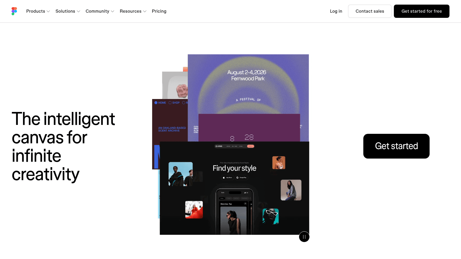
Figma remains the default shared canvas for most product teams, which matters less for its features than for the fact that engineers, PMs and designers can all open the same file. A workflow where non-designers can't see the current state generates status meetings instead of progress.
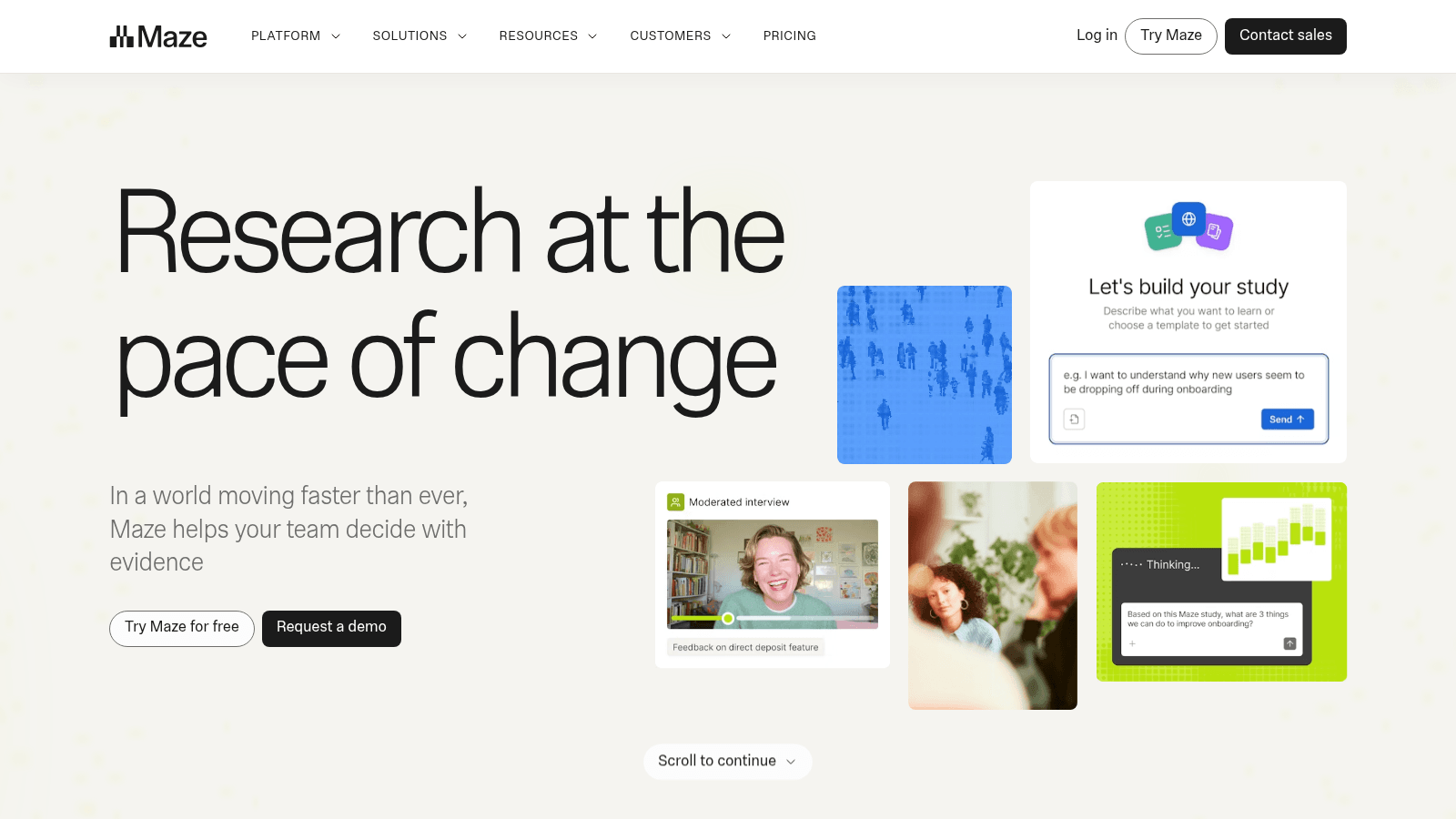
Maze covers the testing stage, pitching research at the pace of product decisions. The category matters more than the specific vendor: if testing requires booking a specialist, it will be skipped under deadline, and unmoderated testing exists to stop that.
Beyond those, most teams need only a place to store research findings that isn't a person's laptop, and a task tracker that engineering already lives in. Our roundup of UI/UX tools goes deeper on the options if you're rebuilding your stack.
Standardize on the smallest set that covers design, testing, and findings storage. Every addition beyond that is a new place for the truth to hide.
Why handoff is where workflows actually break
Handoff is the least glamorous stage and the one that wastes the most time. A design file answers what the happy path looks like and almost nothing else.
The gaps are predictable: loading states, empty states, error states, what happens on slow connections, what the longest realistic string does to the layout, and which of the thirty spacing values was deliberate. Engineers either ask, which costs a day, or guess, which costs a rebuild.
Half of those gaps are text rather than pixels, which is why content design belongs in the workflow well before handoff. Our roundup of UX design practices covers the interface half.
Fix it with a short, boring checklist attached to every handoff:
- Every state drawn, including empty, loading, error, and success
- Behavior at the smallest and largest supported screen widths
- What happens with the longest realistic content, not the demo content
- Which components come from the design system and which are new
- The one-line reason behind any decision that looks arbitrary
That list takes twenty minutes to complete and routinely saves several days. Our guide to scaling design ops covers how to make this habitual rather than heroic.
How to improve a workflow you've already got
Don't redesign your whole UX workflow process at once. Run a retrospective on the last shipped project, find the single stage where work got redone, and fix that one.
Rework is the cheapest signal available. If wireframes got rebuilt, the problem was upstream in scope or synthesis. If engineering rebuilt something, the problem was handoff. If a feature launched and did nothing, the problem was that discovery never happened.
Measure cycle time per stage for a couple of months before changing anything structural. Teams usually assume design is the bottleneck and discover the calendar is mostly waiting for approvals, which is a governance fix rather than a process one.
When Awesomic plugs into an existing team, the first week is mostly learning which stage genuinely has a queue. It's rarely the one the team names first, and adding capacity to the wrong stage just moves the pile along.
Also match the workflow to the team you have. A three-person team running an enterprise workflow spends more time on ceremony than on the product, and our comparison of freelancers versus a UI/UX agency is a useful reality check on what different staffing models can realistically sustain.
Start with one page
Write your workflow on a single page this week: stages, owners, inputs, outputs. Show it to an engineer and a PM, and fix whatever they read differently from you. That disagreement is the workflow problem you've been paying for.
If the constraint is capacity rather than process, that's a different fix. Awesomic matches you with vetted designers in up to 24 hours on a flat monthly fee, covering UI and product work without the hiring cycle.
You can browse our talent or Book demo to talk through what your team is missing. Our roundup of UX design agencies is worth a look if you're weighing the alternatives.
FAQ
What is a UX workflow?
It's the repeatable sequence of stages a design team runs to take a problem from definition to engineering handoff, with a named owner and a defined output for each stage. It differs from a user flow, which diagrams a user's path through a product, and from a UX process, which is the broader philosophy the workflow implements.
What are the main stages of a UX design workflow?
Scope and alignment, discovery research, synthesis, ideation and low-fidelity design, high-fidelity design and prototyping, usability testing, handoff, and post-launch review. Different sources split these into seven or eight steps, but the substance is consistent. The post-launch review is the stage teams most often drop, and its absence is why the same mistakes recur.
How does a UX workflow change in an agile team?
It splits into two parallel tracks. Discovery works on upcoming problems while delivery supports what's currently being built, with the same designers usually spanning both. The alternative, trying to complete a full design cycle inside one two-week sprint, compresses research and testing until they disappear.
How long should UX discovery take?
Scope it to the decision, not the topic. For a feature-sized question, one to two weeks is typical, and it should start with the analytics, tickets and call notes you already have before any new interviews. If no possible finding would change the plan, skip discovery entirely rather than performing it.
Do small teams need a formal UX workflow?
They need a written one, not a formal one. Four stages with named owners on a single page gives a small team the alignment benefit without the ceremony cost. Importing an enterprise workflow into a five-person company usually adds approval gates that slow delivery without improving quality.
One subscription and your hiring problems solved

FAQ


Awesomic is a revolutionary app that matches companies with vetted professionals across 30+ skill sets, from design and development to marketing and product. Based in San Francisco with a global core team, we offer a faster and more flexible alternative to traditional hiring through a subscription-based model. Awesomic delivers high-quality talent on demand, without the delays of recruiting.
We function as a subscription-based service that matches you to top-tier, vetted talent. Submit a project in just a few clicks and start receiving deliverables in as little as 24 hours. Scale your Awesomic plan up or down as your business needs change.
Every Awesomic subscription comes with unlimited revisions. You receive daily progress updates via the app, and you can provide feedback or request iterations as needed. If your project requires a different approach, you can request a talent rematch at any time, at no extra cost. You can also add teammates to collaborate and streamline feedback
A talent marketplace is a platform that utilizes data and intelligent matching algorithms to connect professionals with projects based on their skills, experience, and availability. While often used internally by large companies, Awesomic applies this model at scale, matching vetted global talent to your most critical business needs.
Hiring is time-consuming, expensive, and risky. Awesomic eliminates that problem. We rigorously vet all talent for technical ability, communication, and soft skills, ensuring only senior-level professionals work on your projects. You skip the job posts, interviews, and delays, and get straight to results.
No, Awesomic goes beyond design. While many clients utilize us for branding, UI/UX design, or motion graphics, we also provide vetted talent in no-code web development, product design, marketing, and more. Think of us as an extension of your team. A flexible, high-performing creative partner from planning to execution, whether you're building awesome products or scaling your team.
You can talk directly with your matched talent via the Awesomic app, connect via Slack, email, or schedule video calls. No matter the plan, you’ll receive daily updates in the app for every active task. You can also tag us in for any issues through our in-app customer chat.


