




Best Data Visualization Tools in 2026 (Free and Paid)

.png)
Key takeaways:
- Eight of the 12 tools here have a free plan or free edition. Domo and ThoughtSpot, two of the four that don't, offer trials instead.
- Each free plan holds back something different: Power BI Free can't share at all, Tableau Public and Flourish's free plan publish in public, and Datawrapper's free charts export as PNG with an attribution line.
- Viewer licensing is the cost trap. Below Power BI's capacity tiers, every viewer needs a paid license, not only the person who builds the report.
- Match the tool to the job: a BI platform for company reporting, a charting tool for published charts, and an AI analysis tool such as Julius AI for quick questions about a spreadsheet.
Data visualization tools turn rows of numbers into charts, maps and dashboards you can read in seconds. Picking one is harder than it looks, because the category holds three different kinds of product, priced four different ways, and the free plans differ more than the paid ones.
This list is for founders, marketers, analysts and ops leads choosing a tool in 2026. It covers enterprise BI platforms, online charting and data-storytelling tools, and one AI analysis tool, with every price taken from the vendor's own page on September 11, 2026.
Our own Awesomic Studio comes first: an AI workspace where agents build a custom dashboard page from data you bring, not a BI platform. Designing a dashboard's interface (the grid, the type, the component states) is a separate job done in UI design tools, and nothing below replaces them.
What are data visualization tools?
Data visualization software takes data from a file, a database or an app and draws it as something readable at a glance: a bar chart, a map, a row of KPI cards. The better data visualization platforms keep that picture current, so the chart moves when the numbers do.
The three kinds here solve different problems. BI platforms connect to company data, apply one set of definitions and permissions, and serve dashboards to many viewers. Charting tools turn a spreadsheet into a polished chart to embed, and AI analysis tools answer a plain-English question with a chart.
Drawing a chart and finding an answer are different jobs. One Tableau user on Reddit put it bluntly: "It's a visualization tool. If you want to do data analytics, it's not the right tool." That's one practitioner's view, but it's a fair prompt to know which job you're buying for.
Most bad charts fail on design rather than data: crowded labels, weak contrast, no clear order of importance. The principles of design apply to a dashboard as much as to a poster, and no tool applies them for you.
The 12 best data visualization tools in 2026
The table follows the list's order. Prices are the lowest published rate on each vendor's own page as of September 11, 2026, and "Custom" means the vendor quotes only through sales.
| Tool | Best for | Key features | Main limitation | Pricing (from) | Rating |
|---|---|---|---|---|---|
| Awesomic Studio | Branded dashboards without a BI team | Agent-built dashboards, scheduled refreshes, hosted links | No warehouse or database connectors | $20/month | ★★★★☆ |
| Tableau | Governed enterprise dashboards | Tableau Agent, R and Python, Slack and Teams | Annual contracts only | Free (Public); $15/user/month, annual | ★★★★★ |
| Microsoft Power BI | Teams on Microsoft 365 | Free Desktop, Copilot in Fabric, up to 48 refreshes a day | Viewers need paid licenses below capacity tiers | Free; $14/user/month, yearly | ★★★★★ |
| Google Data Studio | Free dashboards in the Google stack | Web report editor, connectors, embeds | Pro price not published | Free | ★★★★☆ |
| Qlik Cloud Analytics | Associative data exploration | Associative engine, AI-assisted prep, natural-language search | No free plan | $300/month for 10 users, annual | ★★★★☆ |
| Domo | Pipeline to AI agent in one platform | Drag-and-drop ETL, connectors, governed AI agents | No published pricing, pending sale | Custom | ★★★★☆ |
| ThoughtSpot | Search-driven self-service | Spotter agents, live warehouse connections, natural-language search | No permanent free plan | $50/user/month, annual | ★★★★☆ |
| Metabase | Free self-hosted BI | Unlimited dashboards, embedding | No official support on Open Source | Free (open source) | ★★★★☆ |
| Datawrapper | Clean embeddable charts | Charts, maps, tables | Free exports PNG with attribution | Free; $21/user/month | ★★★★☆ |
| Flourish | Interactive data stories | 50+ templates, data stories, web embeds | No direct paid checkout | Free | ★★★★☆ |
| Infogram | Marketing infographics | AI chart generator, 35+ chart types, brand kit | 10 projects on Free | Free; $19/month, annual | ★★★★☆ |
| Julius AI | Chat-based data analysis | Plain-English questions, reports, slides | Credit-metered on every plan | Free; $16/month, annual | ★★★★☆ |
Ratings are our read of how well each tool turns data into charts people actually use, weighed against the cost of getting there. Tableau and Power BI score highest because they do that at any company size. We rate our own Studio a four: it builds a custom dashboard well but isn't a BI layer.
1. Awesomic Studio
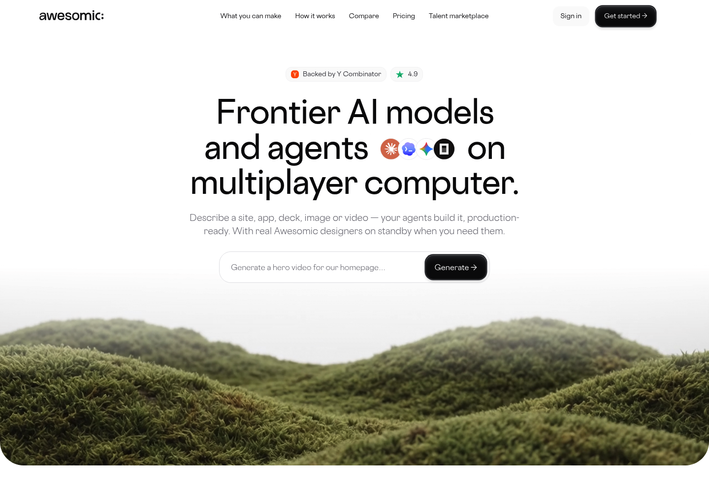
Best for: Branded dashboards without a BI team
Overview: We built Awesomic Studio as an AI workspace where you describe what you want and agents build it. For data, that means a custom dashboard page made from numbers you bring, laid out the way you'd sketch it.
Studio's own page shows an agent-built analytics dashboard among its example work: four KPI cards, a 12-month revenue trend line, a recent-sales list and a Download Report button. The figures are sample data; the layout is the kind founders often ask a developer for.
Studio is new, with no public reviews yet. It comes from the team behind Awesomic, whose design service has worked with 4,000+ companies.
Key features:
- Coding agents (Codex, Claude Code, OpenCode) build a real web page instead of filling a template
- Text, files or links work as a brief, so a CSV export is enough to start
- Scheduled automations rerun refreshes and reports on their own
- Built-in hosting puts it on a live link, private to your team or public
- Export to code or other tools when the page moves to your own stack
- A vetted Awesomic designer or developer steps in when the agents miss
Pricing: Start on Basic at $20 a month, which is all usage budget, plus email support. Move to Pro at $200 or Maximum at $500 once several dashboards need refreshing each month and you want priority support. No free plan or trial is offered, and no rate per build is published.
Pros: your own layout, a live hosted link, scheduled refreshes and reports, a $20 entry point, human backup
Cons: no free plan or trial, and it isn't a BI platform (its integrations list has no warehouse or database connectors, so you supply the data)
How to start using it:
- Export the data as a CSV or spreadsheet, or collect the links.
- Choose Basic on the Studio pricing page to test one dashboard.
- Describe the dashboard: the key numbers, the date range and who reads it.
- Check the first version against your real numbers and request fixes in your own words.
- Publish it to your team and schedule the refresh or weekly report.
Why it earns a place among data visualization tools: It fills the gap between charting tools and BI platforms: a dashboard that looks like your brand, with no BI team to build it. Scheduled automations stop it going stale after launch day.
Final verdict: Choose Studio for a custom, hosted dashboard or client report built from data you can hand over. For a governed BI layer with live database connections, start with the next section.

Enterprise data visualization platforms
The seven platforms in this section sit on company data and serve shared dashboards to whole teams. Pricing is where they split: Data Studio is free for creators and viewers, while Domo quotes every deal through sales.
The software is rarely why a rollout fails. A governed dashboard nobody opens usually has an enterprise UX problem, like twenty filters and no sensible default view, rather than a data problem.
2. Tableau
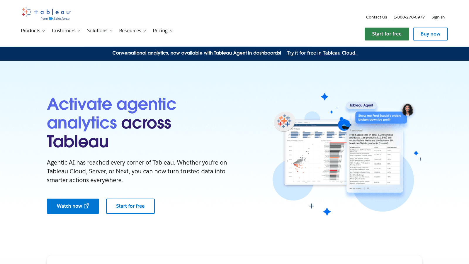
Overview: Tableau sells governed dashboards on role-based licenses. Every deployment needs at least one Creator license, and other users can be Creators, Explorers or Viewers.
Key features:
- Tableau Agent for AI-assisted data prep, exploration and charts
- R and Python integration for models analysts already use
- Slack and Teams collaboration, alongside Tableau Pulse
Pricing: Standard starts at $15 per user per month and Enterprise at $35, both on annual contracts billed annually. Cloud+ and the Tableau+ bundle go through sales.
Pros: AI help from prep to chart, deep analyst tooling, free Public and local Desktop editions
Cons: annual contracts only, simple charts can be slower than in Excel, niche visuals need custom work
Where it fits: Enterprises standardizing on one governed dashboard layer.
Final verdict: The safe large-company pick if you can commit to a year.
3. Microsoft Power BI
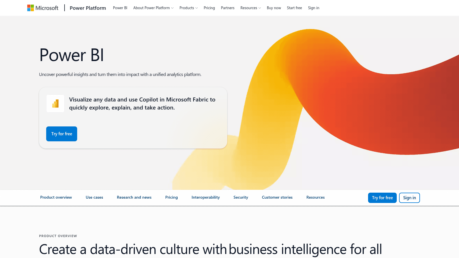
Overview: Power BI is Microsoft's BI tool, and its free tier comes inside a Microsoft Fabric free account. Building reports in Desktop is free, and licensing depends on who views them.
Key features:
- Free Desktop authoring, so building costs nothing until you share
- Copilot in Microsoft Fabric for AI-assisted reports
- 48 dataset refreshes a day on Premium Per User, against 8 on Pro
Pricing: Pro is $14 per user per month and Premium Per User $24, both billed yearly. Embedded and F-SKU capacity pricing varies or goes through sales.
Pros: free authoring, a low Pro seat price, a natural fit with Microsoft 365
Cons: viewers need paid licenses below capacity tiers, Free can't publish or share, Pro caps dataset refreshes at 8 a day
Why it's one of the best data visualization tools: A $14 seat takes a Microsoft 365 team from free authoring to shared reports.
Final verdict: The default for Microsoft shops, if you price every viewer.
4. Google Data Studio (formerly Looker Studio)
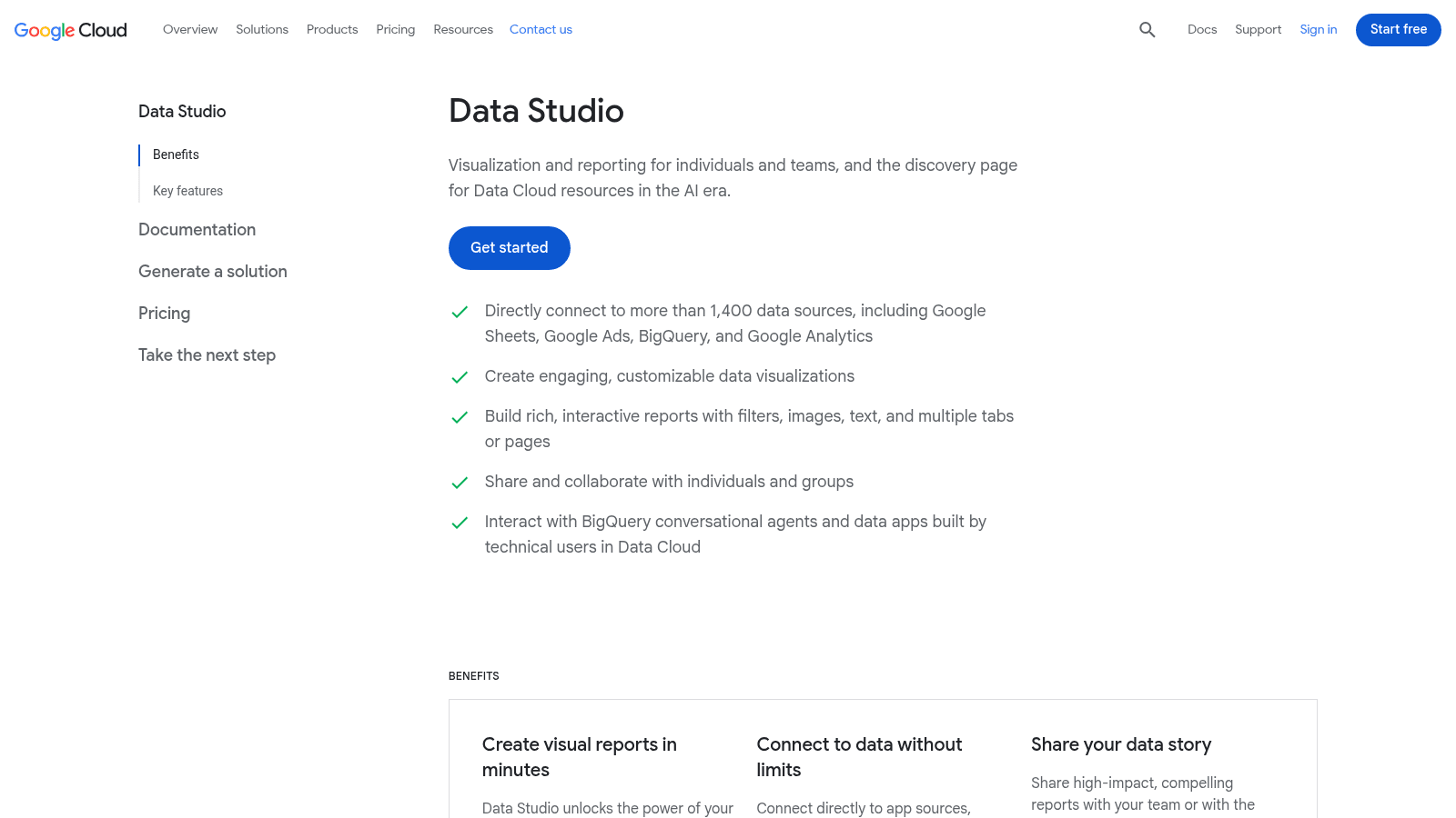
Overview: Looker Studio's product page now carries the Data Studio name and says the tool is free for creators and report viewers. You build interactive reports in the browser, then share them or embed them on any web page.
Key features:
- Built-in and partner connectors, which Google says reach virtually any kind of data
- Real-time collaboration on shared reports
- Conversational Analytics, for chatting with data agents about your data
Pricing: Creators and viewers pay nothing. Data Studio Pro adds team workspaces and organization-owned content, at a per-user price that varies with subscription length and isn't published.
Pros: free for creators and viewers, embeddable reports, a quick start on Google data
Cons: Pro pricing unpublished, team workspaces need Pro, free reports belong to whoever made them
Its real strength: Free, shareable dashboards over your Google data.
Final verdict: The obvious free start for a Google-stack team.
5. Qlik Cloud Analytics (Qlik Sense)
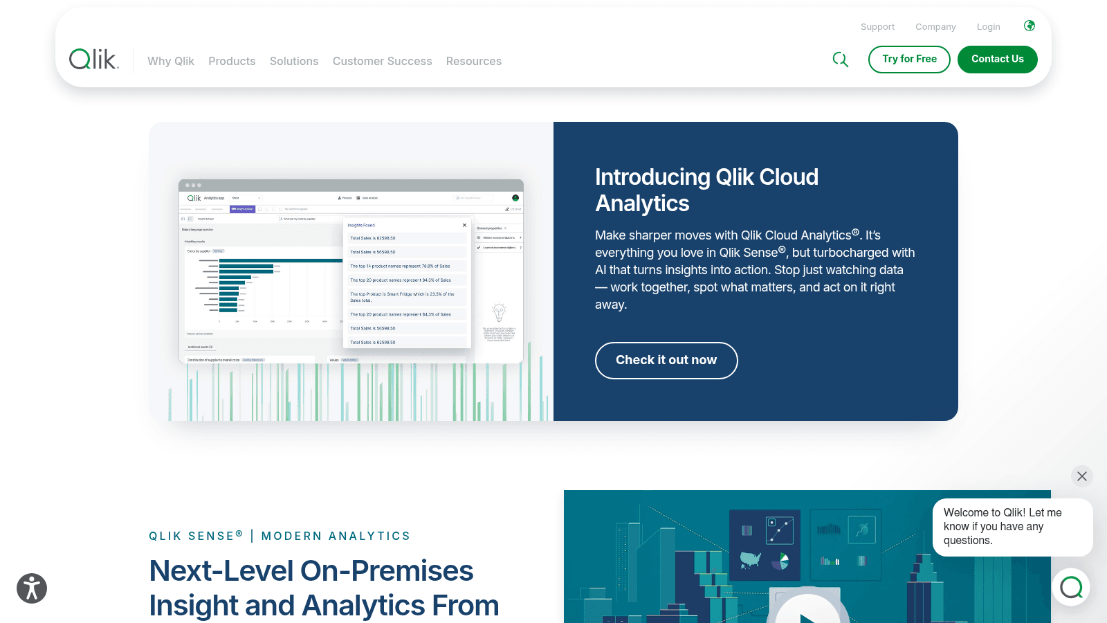
Overview: Qlik Sense is now Qlik's on-premises product, and the cloud version is sold as Qlik Cloud Analytics. Qlik says its associative engine makes open-ended discovery easier than query-based tools do.
Key features:
- Associative engine that links all your data so you can explore in any direction
- AI-assisted creation and data prep
- Natural-language search
Pricing: Annual plans scale with data capacity: Starter is $300 a month for 10 users and 10GB, Standard $825 with 25GB, and Premium $2,750 with 50GB plus predictive analytics and AutoML. Enterprise (250GB and up) is custom.
Pros: associative exploration, AutoML on Premium, published team pricing
Cons: no free plan, cost rises with data capacity, Enterprise is quote-only
What it's genuinely good at: Helping analysts find the question, not only answer a known one.
Final verdict: A strong mid-market to enterprise pick when exploration depth matters.
6. Domo
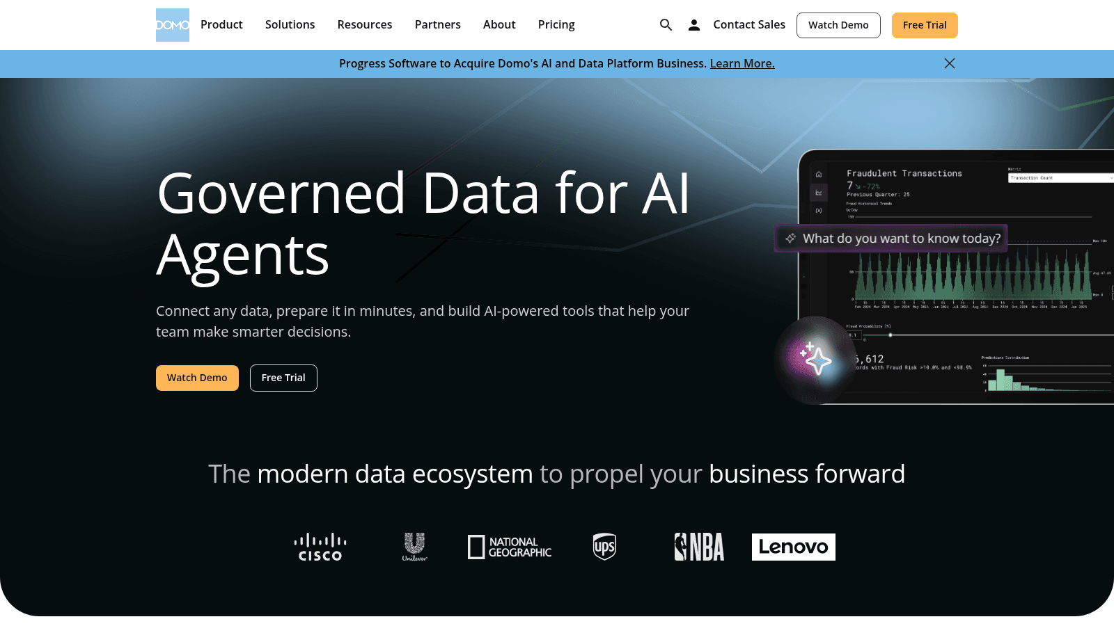
Overview: Domo runs the data pipeline, dashboards and AI agents in one product. On July 22, 2026, it announced a definitive agreement for Progress Software to acquire substantially all of its assets for $400 million, expected to close before November 30, 2026, subject to regulatory approvals.
Key features:
- Drag-and-drop ETL for pipelines without code
- Connectors to Salesforce, SAP, BigQuery, Snowflake and Google Sheets
- AI agents that work from Domo's governed data
Pricing: Nothing is published. A 30-day free trial leads to custom credit-based pricing through sales, with unlimited users and no per-seat charge.
Pros: ETL to AI agents in one place, unlimited users, broad connectors
Cons: no self-serve pricing, credit use is hard to estimate upfront, a pending ownership change
Why teams shortlist it: One contract can replace separate ETL, BI and agent tools.
Final verdict: Worth a trial, but ask how the Progress deal affects your contract.
7. ThoughtSpot
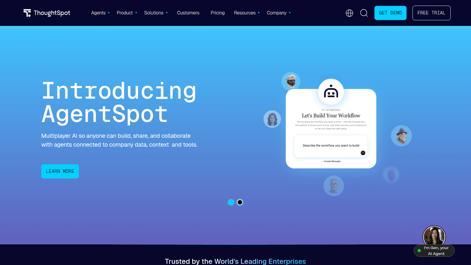
Overview: ThoughtSpot built its product around search: type a question, get a chart. Its homepage now leads with "Introducing AgentSpot," and Spotter agents run conversational analysis on a governed semantic layer.
Key features:
- Spotter agents for search and conversational analytics
- Live connections to Snowflake, Databricks and Redshift
- An MCP server, sold as an Enterprise add-on
Pricing: Pro is $50 per user per month billed annually, with unlimited LLM tokens, up to 1,000 users and 250M rows of data. Essentials is a free trial with no price shown, and Enterprise is contact-sales.
Pros: search-first design, live warehouse connections, unlimited LLM tokens on Pro
Cons: no permanent free plan, Spotter is capped at 25 queries per user a month on Pro, embedding and the MCP server are Enterprise add-ons
Its edge over the rest: Business users get answers without filing a data-team ticket.
Final verdict: Best for teams already running a modern warehouse.
8. Metabase
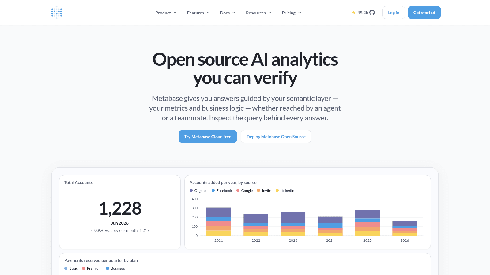
Overview: Metabase calls itself "open source AI analytics you can verify." You can self-host the free edition or pay for its cloud.
Key features:
- Unlimited dashboards and queries, free plan included
- Embedded analytics for charts inside your own product
- An optional AI add-on at $3.75 per 1M tokens
Pricing: Open Source is free to self-host. Cloud Starter is $100 a month with 5 users ($6 per extra), Pro $575 with 10 ($12 per extra), and Enterprise from $20,000 a year, with 14-day trials on Starter and Pro.
Pros: free self-hosting, unlimited dashboards, embedding
Cons: no official support on Open Source, add-ons make totals hard to predict, self-hosting means someone has to run the server
Where it beats the alternatives: Engineering-led teams get real BI for the cost of a server.
Final verdict: For teams that would rather run software than pay per seat.
Online data visualization tools for charts and data stories
The three tools in this section run in the browser and are built for publishing: a chart in an article, an interactive story, an infographic in a report.
When a data story needs custom animation or interaction that no template covers, you've left tool territory for the kind of work interactive design agencies quote for.
9. Datawrapper
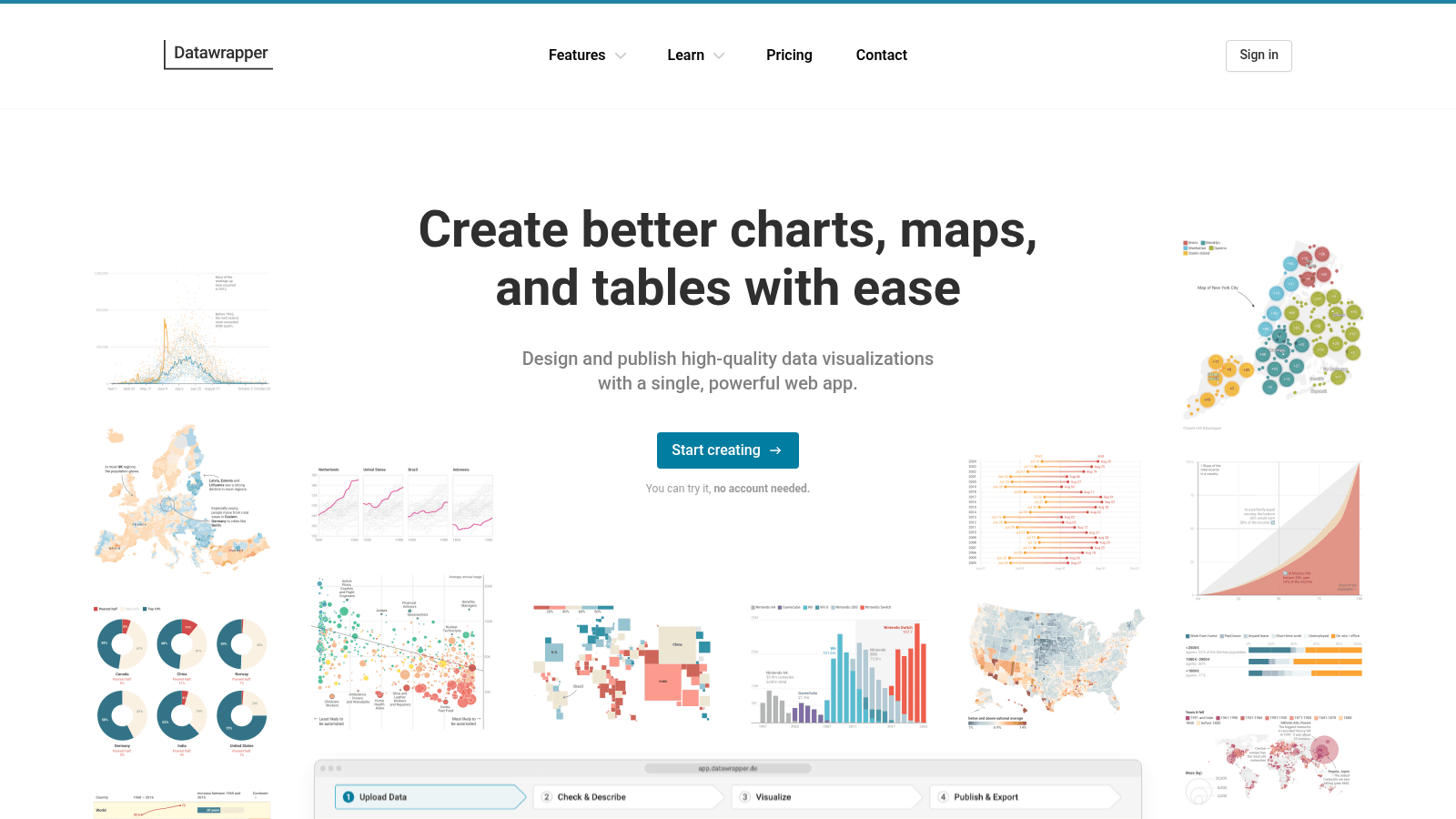
Overview: Datawrapper, made by Datawrapper GmbH in Berlin, turns your data into a clean chart, map or table to embed, with no cap on how many you make for free.
Key features:
- Interactive charts, maps and tables to publish and embed
- PDF and SVG export on Custom, for print and design handoff
- Team permissions and more chart types on Team
Pricing: Free exports PNG with a Datawrapper attribution line. Custom is $21 per user per month and Team $39, both excluding VAT, with a $499-a-month theme add-on and Enterprise through sales.
Pros: unlimited free charts, clean defaults, self-hosting and SSO on Enterprise
Cons: Free exports PNG only, free charts carry attribution, per-user pricing adds up
Why newsrooms pick it: Data in, clean embeddable chart out, with no designer needed.
Final verdict: A strong free choice for single charts.
10. Flourish
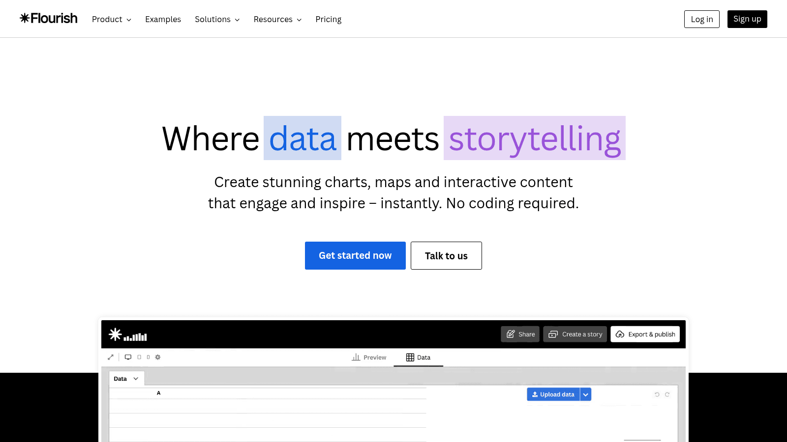
Overview: Flourish, owned by Canva since 2022, builds interactive charts, maps and data stories without code. Its free plan includes unlimited projects and the full template range, but published work is public.
Key features:
- Scrollytelling stories that change as the reader scrolls, on Publisher
- Live updates from a Google Sheet or public CSV, also on Publisher
- Canva and PowerPoint embeds with Presenter
Pricing: The free plan publishes publicly with attribution. Presenter comes only inside a Canva Business or Enterprise subscription, while Publisher and Enterprise need a sales conversation.
Pros: the full template range on Free, private drafts until you publish, a plain-language AI assistant
Cons: free work is public, no direct paid checkout, Presenter needs a Canva subscription
Who it suits: Interactive data stories for a public audience, at no cost.
Final verdict: Hard to beat on price when your charts go public anyway.
11. Infogram
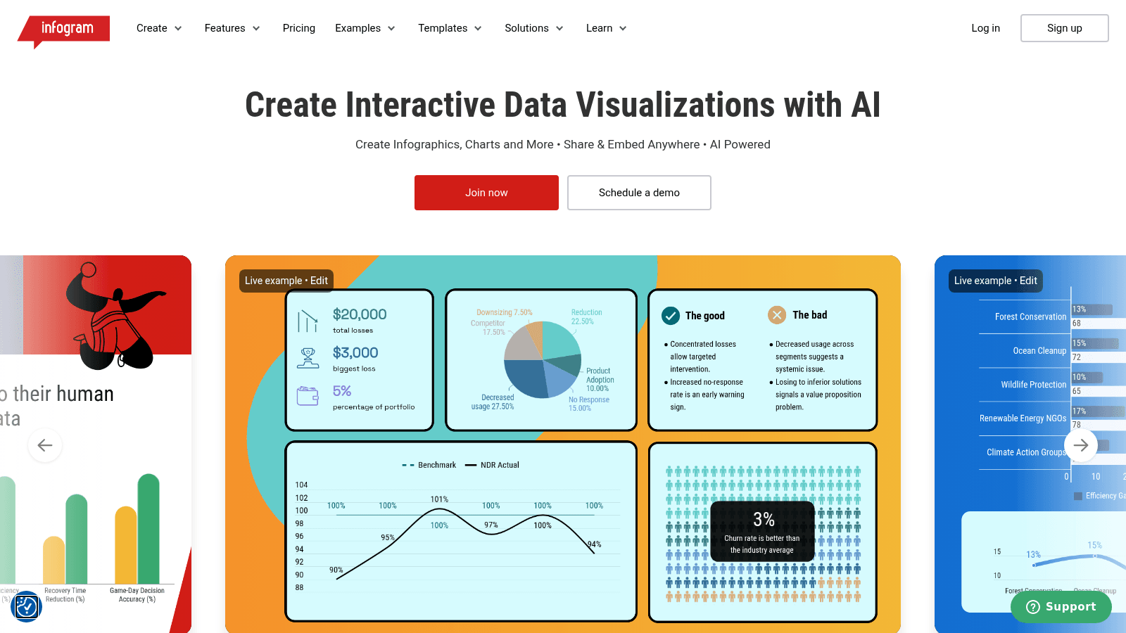
Overview: Infogram, owned by Prezi, pitches itself as a way to "create interactive data visualizations with AI," aimed at marketing teams making infographics and reports rather than BI dashboards.
Key features:
- An AI chart and infographic generator
- 35+ interactive chart types
- A brand kit for consistent colors and logos
Pricing: Paid plans bill annually: Pro is $19 a month, Business $67 and Team $149 for 3-10 users, with Enterprise on request. Free Basic allows 1 user, 10 projects and 5 pages per project.
Pros: the AI generator, 35+ chart types, custom branding on Business
Cons: Free caps you at 10 projects, real-time collaboration only on Team, SQL connectors only from Business up
Why it made this list: On-brand charts for marketing reports, with no BI tool involved.
Final verdict: Good for infographics and reports, less so for governed dashboards.
AI tools for data visualization
AI now sits inside most of the platforms above: Tableau Agent, Copilot in Microsoft Fabric, ThoughtSpot's Spotter and Data Studio's data agents all take plain-English questions. Julius AI starts from the chat instead.
Turning one prompt into charts, a written report and a slide deck makes Julius a narrow form of content creation automation for analysts who present every week.
12. Julius AI

Overview: Julius AI is an AI workspace for analysis: ask a question about your data in plain English and get charts, a report or a presentation back. It also builds websites, images and video.
Key features:
- Plain-English questions that return charts and cited answers
- Reports and presentations from the same analysis
- A Google Drive connector, even on Free
Pricing: Free runs on a daily credit allowance without exports. Plus is $20 a month ($16 billed annually) with 2,000 credits, Pro $45 ($37) with 5,000, Max $200 ($166) with 25,000, and Business $450 ($375) with 60,000 plus team collaboration.
Pros: quick answers from a spreadsheet, a usable free tier, slides from the same analysis
Cons: credit-metered even on paid plans, report and presentation export only from Plus, team collaboration starts on Business
What it does best: A fast first read of a dataset nobody has explored yet.
Final verdict: An analyst's sidekick, not a replacement for a dashboard your team checks daily.
How we chose the best tools for data visualization
We started from the three jobs people usually mean: company-wide dashboards, publishable charts, and quick answers from a file. Each tool had to do at least one of them well and show real pricing or a clear sales route.
On September 11, 2026, we checked each vendor's pricing and product pages directly rather than trusting older roundups. That turned up four facts worth knowing: Looker Studio now appears as Data Studio, Qlik sells its cloud product as Qlik Cloud Analytics, Flourish sells Presenter only through Canva, and Domo has agreed to sell substantially all its assets to Progress Software.
We also checked each free plan against what it can't do, since the title promises free options.
What to look for in data visualization software
The chart count on a vendor page is the least useful number. These checks decide whether a tool fits your team:
- Who needs a paid license just to view a dashboard, not only to build one
- How often data refreshes on your plan, since Power BI Pro refreshes a dataset 8 times a day and Premium Per User 48
- Whether it connects live to your warehouse or needs a file upload
- What the free plan exports, and whether it adds an attribution line
- Whether free work is public, as on Tableau Public and Flourish's free plan
- Whether you can embed charts in your site or product
- How AI features are billed, whether included, per seat, per credit or per token
Chart types matter more than chart count. In their 1984 study in the Journal of the American Statistical Association, Cleveland and McGill ranked how accurately people read visual encodings: position along a common scale first, then position along nonaligned scales, then length, direction and angle, then area, then volume and curvature, with shading and color saturation last.
In practice, a bar or dot chart beats a pie chart or color shading when you need to compare values. Check that a tool lets you pick the chart and control its axes, instead of handing you a pretty template.
How to choose the right data visualization tool
Start from the job and the audience, then trial two tools with your own data. The table maps common situations to a starting point.
| Your situation | Start with | Why |
|---|---|---|
| Company reporting on Microsoft 365 | Power BI | Free authoring, $14 Pro seats |
| Governed dashboards across departments | Tableau or Qlik Cloud Analytics | Role-based licenses or associative exploration |
| Data already in Google products | Data Studio | Free for creators and viewers |
| Engineering team, tight budget | Metabase Open Source | Free self-hosting, unlimited dashboards |
| Charts for articles or reports | Datawrapper or Flourish | Free plans built for embedding |
| Quick answers from a spreadsheet | Julius AI | Plain-English questions on a free tier |
| A branded dashboard page, no BI team | Awesomic Studio | Agents build it, automations refresh it |
If no row fits cleanly, you probably need two tools: a BI platform for internal numbers and a charting tool for anything public.
A dashboard your customers see is a different project from one your ops team checks. Someone has to design its empty states, filters and small-screen layout, and in an AI product that's the brief an AI dashboard designer takes on.
How much data visualization tools cost
The pricing model drives the bill more than the headline price, and the four models here behave very differently as a team grows.
| Pricing model | Tools | What grows the bill | Watch for |
|---|---|---|---|
| Per user | Tableau, Power BI, ThoughtSpot, Datawrapper | Builders and, often, viewers | Viewer licenses below Power BI's capacity tiers |
| Flat team plan | Qlik Cloud Analytics, Metabase, Infogram | Data capacity, projects or extra users | Qlik's data caps, Metabase's extra-user fees |
| Credits or usage budget | Domo, Julius AI, Awesomic Studio | How much you run | Burn is hard to forecast until you've used it for a month |
| Free, with paid tiers through Google, Canva or sales | Data Studio, Flourish | Team features | Data Studio Pro and Flourish Publisher prices aren't published |
Viewer licensing is the line that surprises teams. One Power BI user on Reddit described the catch: publish a report into a Premium Per User workspace, and every viewer needs their own PPU license too, not just the author. That's one practitioner's experience, and it lines up with Microsoft's rule that viewers below capacity tiers need a paid license.
The license is rarely the biggest cost anyway. The Bureau of Labor Statistics puts 2025 median pay for data scientists at $120,230 a year and projects their employment to grow 35% from 2025 to 2035, much faster than average. A tool that saves those people a few hours a week can justify a pricier seat.
Is a free data visualization tool enough?
For one analyst or a public chart, often yes. The table lists the eight tools on this list with something free, and what each one can't do.
| Tool | Free option | What it can't do |
|---|---|---|
| Tableau | Tableau Public; free local Desktop edition | Keep data private on Public, or publish to the cloud from Desktop |
| Power BI | Free account | Share or publish reports |
| Data Studio | Free for creators and viewers | Team workspaces, which need Pro |
| Metabase | Open Source, self-hosted | Come with official support |
| Datawrapper | Free plan | Export beyond PNG or drop the attribution line |
| Flourish | Free plan | Keep published work private |
| Infogram | Basic | Go past 1 user, 10 projects and 5 pages per project |
| Julius AI | Free plan | Export reports or presentations |
The other four have no free plan, though Domo offers a 30-day trial and ThoughtSpot a free Essentials trial. Pay when the free limit blocks something you need every week, which is usually sharing with people who don't build.
How to test a data visualization tool in one week
Pick two tools from the decision table and run the same test in both, using your own data rather than the vendor's sample set:
- Rebuild one chart or dashboard your team already uses, with the same numbers.
- Share it with two people who only view, and note what that costs on the plan you'd buy.
- Change the source data and see how long the chart takes to update.
- Export it the way you'd publish it: an embed, a PDF or a slide.
- Price the plan at your real headcount for a full year, not the trial.
Whichever tool wins, the dashboard still has to read well. If it will live inside your product, treat it as part of your SaaS product design rather than a reporting add-on, because customers judge it like any other screen. And if what you need is one branded dashboard your team or a client opens every week, that's the job we built Studio for.
FAQ
What are the best tools for data visualization for beginners?
Start with free online data visualization tools that work from a spreadsheet: Datawrapper for single charts, Flourish for interactive ones, or Data Studio if your data sits in Google products. Datawrapper's free plan has no cap on charts. Move to Power BI or Tableau once you need shared, refreshed dashboards.
Which data visualization software is free?
Eight on this list offer a free plan or edition: Tableau (Tableau Public and a local Desktop edition), Power BI, Data Studio, Metabase Open Source, Datawrapper, Flourish, Infogram and Julius AI. Each limits something, most often sharing, export formats or project count. Of the four without one, Domo and ThoughtSpot offer trials.
How are enterprise data visualization platforms different from charting tools?
Enterprise platforms such as Tableau, Power BI and Qlik Cloud Analytics sit on company data, enforce shared metric definitions and access rules, and are usually priced per seat or by capacity. Charting tools such as Datawrapper and Flourish start from a spreadsheet and produce a polished chart to publish. Many teams use one of each.
Are AI tools for data visualization accurate?
AI tools are only as accurate as your data and your question. Julius AI and the AI features in Tableau, Power BI and ThoughtSpot draw a chart from a plain-English prompt, but they can pick the wrong column or a weak chart type. Check the numbers before sharing, and prefer bar or dot charts, which rely on position, the encoding Cleveland and McGill found people read most accurately.
Can you build a dashboard without a BI team?
Yes, if your data fits in files or spreadsheets. Data Studio handles simple dashboards over Google data at no cost, and Tableau's free Desktop edition analyzes Excel and CSV files on your own machine, though it can't publish online. Once you need governed definitions across departments, you'll want a BI platform and someone to own it.
One subscription and your hiring problems solved


FAQ


Awesomic is a revolutionary app that matches companies with vetted professionals across 30+ skill sets, from design and development to marketing and product. Based in San Francisco with a global core team, we offer a faster and more flexible alternative to traditional hiring through a subscription-based model. Awesomic delivers high-quality talent on demand, without the delays of recruiting.
We function as a subscription-based service that matches you to top-tier, vetted talent. Submit a project in just a few clicks and start receiving deliverables in as little as 24 hours. Scale your Awesomic plan up or down as your business needs change.
Every Awesomic subscription comes with unlimited revisions. You receive daily progress updates via the app, and you can provide feedback or request iterations as needed. If your project requires a different approach, you can request a talent rematch at any time, at no extra cost. You can also add teammates to collaborate and streamline feedback
A talent marketplace is a platform that utilizes data and intelligent matching algorithms to connect professionals with projects based on their skills, experience, and availability. While often used internally by large companies, Awesomic applies this model at scale, matching vetted global talent to your most critical business needs.
Hiring is time-consuming, expensive, and risky. Awesomic eliminates that problem. We rigorously vet all talent for technical ability, communication, and soft skills, ensuring only senior-level professionals work on your projects. You skip the job posts, interviews, and delays, and get straight to results.
No, Awesomic goes beyond design. While many clients utilize us for branding, UI/UX design, or motion graphics, we also provide vetted talent in no-code web development, product design, marketing, and more. Think of us as an extension of your team. A flexible, high-performing creative partner from planning to execution, whether you're building awesome products or scaling your team.
You can talk directly with your matched talent via the Awesomic app, connect via Slack, email, or schedule video calls. No matter the plan, you’ll receive daily updates in the app for every active task. You can also tag us in for any issues through our in-app customer chat.


